
Yes, I’d recommend matching your porch to your house color for a calm, intentional look that lets your eye travel smoothly across the facade. That said, you don’t need to be boring—a contrasting front door or soft-colored ceiling adds personality without creating visual chaos. The key is restraint: let one accent shine while everything else remains harmonious. Want to know which specific combinations work best and how to test colors first?
The Case for Matching Your Porch to Your House Color
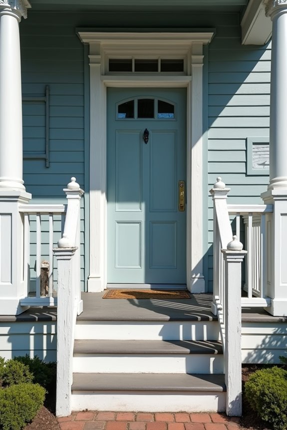
Why not keep things simple? When you match your porch to your house color—including the trim—you’re creating visual unity. It’s like wearing an outfit where everything goes together, you know?
Here’s what happens: your home feels bigger and more complete. The eye travels smoothly from your porch across your facade without stopping at jarring color changes. You’re not fighting against yourself visually.
Plus, matching cuts down on maintenance headaches. You’re buying one paint color instead of three, touching up one palette instead of juggling multiple shades.
Don’t worry though—matching doesn’t mean boring. A contrasting front door still stands out beautifully against unified colors, giving you that visual anchor you’re after. You get simplicity *and* personality.
Why Matching Creates Calm, Cohesive Curb Appeal
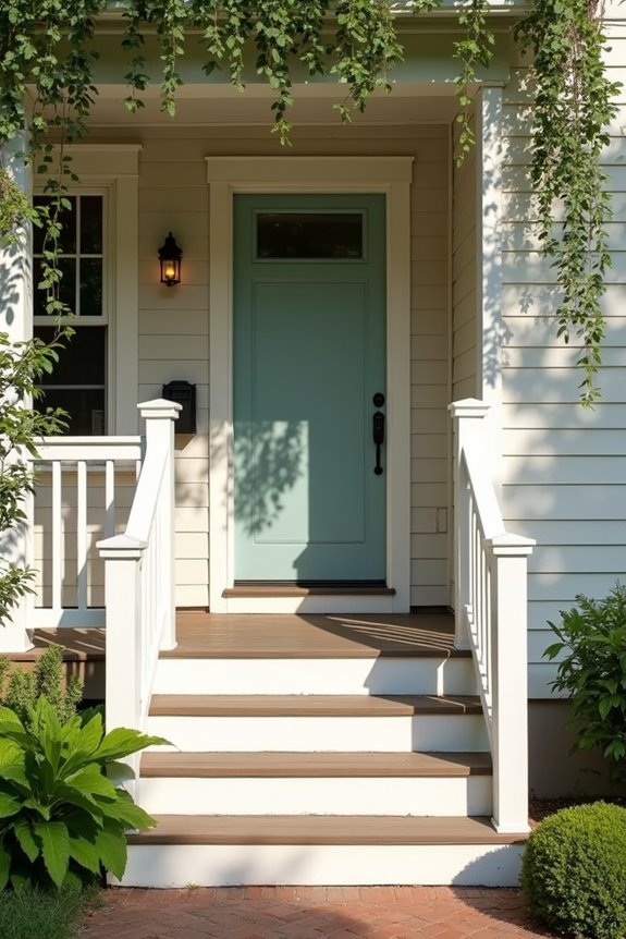
When you match your porch color to your house, you’re creating visual harmony that makes your home feel organized and deliberate. This unified approach establishes structural unity through color, so your eyes naturally flow from one part of your exterior to the next without stopping or feeling jarred. This consistent design flow principle does something powerful—it calms your nervous system and tells visitors your home is thoughtfully designed, all before they even step inside.
Visual Harmony And Balance
How’d you like your home to feel more put-together, without adding a single new element?
When your porch matches your house’s body and trim color, you’re creating color harmony that demonstrates careful planning and refinement. This unity between body and trim isn’t boring—it’s sophisticated. You’re establishing visual calm that makes your whole home appear thoughtfully designed.
Here’s what matching accomplishes:
- Creates a streamlined, polished first impression
- Reduces visual clutter and mental overstimulation
- Allows your front door to shine as the main focal point
- Makes your home feel larger and more cohesive
- Builds a sense of belonging in your landscape
Your exterior color scheme becomes a canvas, not chaos. When everything aligns, your eye travels smoothly across your home’s face. That restrained approach? It whispers confidence far louder than competing colors ever could.
Structural Unity Through Color
The real magic happens when you stop fighting your home’s natural lines and start working with them. Color unity helps your porch become a deliberate extension of your home’s structure. When your porch integrates with your exterior scheme, you’re not just painting—you’re creating belonging, a sense that everything fits together by design.
| Approach | What You Get | Maintenance |
|---|---|---|
| Matching colors | Calm, unified appearance | Easier touch-ups |
| Multiple colors | Busy appearance | More upkeep |
| Unified scheme | Visual strength | Simplified care |
| Strategic accents | Deliberate focal points | Manageable focus |
This porch integration strengthens your home’s visual foundation. Your structure feels complete, grounded, and considered. You’re not creating visual confusion—you’re building harmony that makes people notice why your place works well together.
Consistent Design Flow Principles
Ever notice how some houses feel cohesive, while others seem to fight against themselves?
That’s what happens with color flow. When your body and trim work together, you’re creating calm instead of chaos. I’ve found that matching your porch to your house body and trim creates visual harmony—it reads as deliberate and welcoming.
Here’s what matters:
- Unified exteriors are quieter than disjointed ones
- Matching colors allow your landscape to stand out
- Your eye settles instead of bouncing around
- Focal contrast (like a bold door) gains strength against calm backgrounds
- Visitors sense belonging before they knock
Think of it this way: consistent color flow is your foundation. Your porch becomes part of the story, not a plot twist. When everything flows together, your home communicates what it is—clearly and directly.
When Your Porch Should Be a Different Color

Why stick with matching colors if a different porch shade actually works better for your home?
I’ve found that a contrasting porch color can brighten your entire space, especially in open-concept layouts where your porch flows into interior rooms. The key is choosing complementary or neutral palettes that create cohesion without monotony.
When you’re ready to break the rules, start small. Test paint samples on your porch first—this manageable approach helps you see how the new porch color interacts with your roof, trim, and fascia before committing fully. A lighter shade can also make your porch feel more spacious and welcoming.
The real benefit happens when your porch color harmonizes with your interior furnishings and decor. That’s when your porch becomes an extension of your home’s personality.
Five Key Factors That Determine Your Porch Color Choice
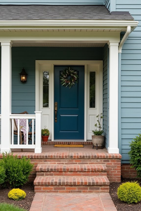
I’ve learned that five key factors shape your porch color choice, and they’re worth your attention. You’ll want to think about visibility, durability, interior flow, and how your exterior design connects with your home’s overall aesthetic. Color harmony doesn’t mean matching perfectly—it means creating a space that works well together.
Here’s what I’d prioritize:
- Street visibility – Choose complementary colors if neighbors see your porch
- Interior sightlines – Lighter porch colors brighten your home’s flow
- Accent coordination – Pull colors from cushions and trim you already love
- Long-term durability – Pick colors that age well through future renovations
- Contrast balance – Use neutral bases with strategic pops of personality
These factors work together, creating a porch that belongs to you.
How Interior Flow Influences Porch Color
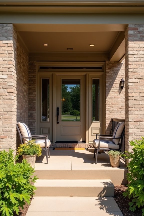
When you can see your porch from inside your home, especially in open-concept layouts, the color you choose becomes part of your interior design story. I’ve found that lighter porch colors brighten those sightlines and make the outdoor space feel like a natural extension of your living area, while clashing colors can interrupt the visual continuity you’ve worked hard to create indoors. The key is thinking of your porch and interior as one connected space, not two separate decisions.
Interior Space Extension
How’d you like your porch to feel like part of your home’s interior rather than a separate outdoor room?
When your porch color complements your interior furnishings, you’re creating exterior-interior harmony that makes your whole home feel unified. I’ve found that lighter porch colors brighten spaces visible from inside, making the transition occur smoothly. Your porch becomes an extension of your living area, not an afterthought.
Consider these benefits:
- You’ll naturally use your porch more for entertaining
- Your interior flow continues outside
- Guests experience a consistent, well-planned design
- Your home feels larger and more connected
- Daily transitions between rooms feel natural
Start by matching your porch color to interior cushions and furniture. Test small areas first. This approach means your porch strengthens your home’s overall design rather than disrupting it.
Color Harmony And Flow
Your porch color isn’t just about what looks good outside—it’s about what you see when you’re standing in your kitchen, sitting on your couch, or walking through your front door. Porch color harmony matters because your porch becomes part of your home’s visual story, especially in open-concept spaces.
When your porch color clashes with interior furnishings, it creates visual discord. Instead, consider how exterior color flow connects with your ceilings, trim, and furniture through windows. A two-tone approach works well when porch and house colors complement each other without being identical.
Neutral porch colors keep things consistent, preventing that jarring disconnect between indoor and outdoor spaces. Think of interior-exterior coordination as creating one unified experience. Your eyes should travel smoothly from inside to outside, making your entire home feel intentionally connected.
Architectural Style as Your Starting Point

Why does your home’s architectural style matter so much when you’re deciding on porch colors? Your architectural style is the foundation for everything—it guides your porch color, architectural style choices, and overall color coordination. When you align your decisions with your home’s character, you create a space that works well together.
Your architectural style is the foundation for everything—it guides your porch color and overall design cohesion.
Consider these style-specific approaches:
- Colonial homes work well with Ionic columns and traditional whites or creams
- Victorian houses feature ornate Corinthian details in rich, layered colors
- Modern homes pair simple, clean lines with bold or neutral tones
- Farmhouse styles welcome warm wood tones and rustic charm
- Cottage aesthetics celebrate cozy wooden columns in soft, inviting hues
When you honor your home’s architectural roots, you’re not just painting—you’re telling your home’s story. That’s when everything comes together.
Roof, Trim, and Fascia Decisions
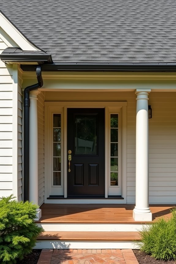
Your roof and trim choices set the stage for deciding whether your porch should match your house, so I’ll help you think through how they work together. The color of your shingles or metal roof, paired with your trim and fascia, creates a visual foundation that either pulls your porch in or pushes it out as a separate feature. Getting these three elements aligned—whether you’re matching them or creating intentional contrast—is what makes your porch feel like a natural part of your home’s overall design, not an afterthought.
Matching Roof and Shingles
When you’re deciding on your porch’s roof color, the point is—it’s one of the biggest visual anchors on your entire home’s exterior. I’ve found that matching your porch roof and shingles creates visual cohesion across your home’s design. Here’s why this matters:
- Creates a unified, polished appearance that’s intentional
- Strengthens your home’s identity and overall aesthetic
- Simplifies decision-making for other exterior colors
- Builds visual confidence in your space
- Makes your porch feel like it truly belongs to your home
For shingle roofs, I recommend keeping your porch color and roof and shingles aligned. This approach eliminates guesswork and delivers consistent results. You’ll notice how matching these elements brings your exterior into a cohesive whole, rather than disconnected sections.
Harmonizing Trim and Fascia
The trim and fascia around your porch are like the frame around a picture—they deserve just as much attention as the main elements. You can either match your trim and fascia to your house color for a clean, unified look, or you can create contrast to highlight your porch’s architectural features.
When you choose contrast, you’re drawing attention to details like doors and windows. This strategy works well, but here’s what matters: make sure your trim and fascia choices align with your roof color and siding. This balance prevents your exterior from feeling chaotic or overdone.
Matching everything creates cohesion. Contrasting deliberately emphasizes character. Either way, you’re creating an exterior that looks planned and welcoming.
Grounding Your Color With Materials and Landscape

Consider these grounding elements:
- Fiberglass or PVC columns that match your chosen palette
- Natural textures in your foundation speaking to trim colors
- Distance views—how does your house read from the street?
- Seasonal changes in surrounding greenery
- Proportion between large structural elements and accent colors
This alignment between materials, landscape, and color creates homes with deliberate design choices.
Door Color: Your Punctuating Accent
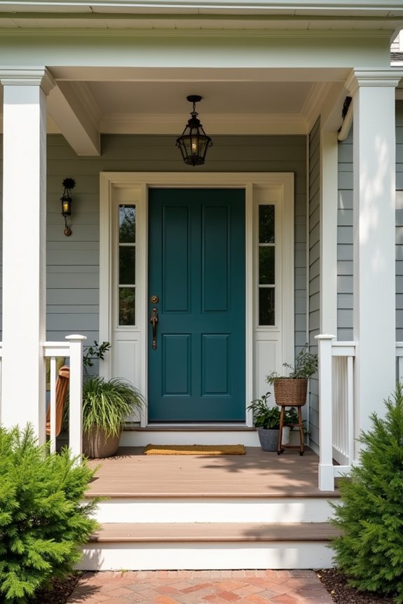
Once you’ve grounded your home’s palette with materials and scenery, your front door becomes your chance to make a statement. I recommend choosing an accent color that contrasts with your white body and trim—think duck-egg blue or soft green. This front door color creates a visual focal point without overwhelming your cohesive exterior.
Your door punctuates rather than competes. When your house body stays calm and unified, that single accent color stands out naturally. Against wooded landscapes, a white exterior makes your colored door more noticeable and deliberate.
Pair your door with complementary details, like a light blue porch ceiling. This reinforces your color story and keeps everything feeling connected. You’re not adding busyness—you’re adding personality to a thoughtfully designed home.
Adding Accent Colors to Porch Ceilings and Details
Your porch ceiling and trim details offer an excellent opportunity for creative color choices without affecting your home’s overall appearance. Consider two primary approaches: paint your ceiling a classic pale blue or soft blue-green to reflect the sky, or use contrasting trim and railings that coordinate with your house color while maintaining visual balance. The effectiveness of these accent colors depends on how they interact together—white borders around your deck, darker railings, or lighter ceilings paired with a darker porch body—to build depth and connect back to your house’s existing palette.
Ceiling Color Options
How’d you like to make your porch feel twice as spacious without adding a single square foot?
Your porch ceiling color deserves thoughtful consideration. I’ve found that selecting the right shade affects how your entire porch feels. Light ceilings push the space upward visually, creating that airy sensation we all crave. Consider these options for harmony with your house:
- Pale blue ceilings that echo the sky above
- White or cream tones that brighten darker exteriors
- Soft blue-green shades that feel calming and cohesive
- Neutrals matching your exterior palette, like Revere Pewter
- Contrasting hues that add personality while maintaining balance
I’d recommend visualizing your choice against your home’s actual colors. Take photos or videos showing different options in natural light. This approach helps you see how your porch ceiling color integrates with your landscape and house’s overall character before committing.
Detail Accent Strategies
Want your porch to really stand out? I’ve found that smart accent strategies make your porch color more inviting. Consider these approaches:
Contrasting trim highlights architectural details beautifully. When your main porch uses neutral tones, colored fascia or borders create deliberate emphasis without overwhelming your exterior color palette.
White borders frame decking wonderfully, linking your porch to your home while emphasizing accents. This creates visual separation that feels purposeful and cohesive.
Coordinate thoughtfully with your interior decor and outdoor furnishings. Your cushions, furniture, and accent strategies should complement your overall design goals.
The key? Your porch color should contrast enough to stand apart, yet harmonize with decking and borders. This balance keeps your home feeling unified while adding personality to your space.
Popular Same-Color Combinations That Work
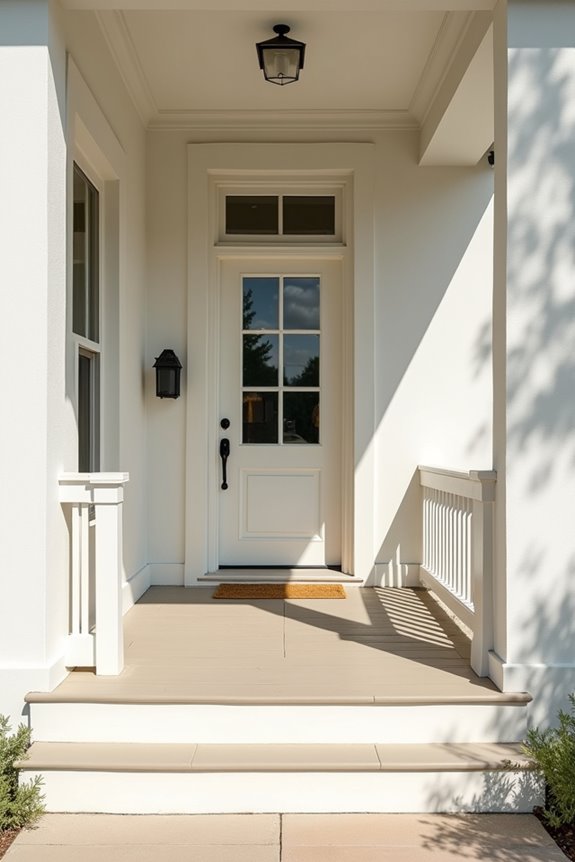
Why’d I recommend keeping your porch the same color as your house? It creates a calm, unified feeling—a home that looks deliberate and well-considered.
When you embrace a single-color scheme, you’re not fighting against your own design. Instead, you’re building exterior color coordination that whispers rather than shouts. Here’s what actually works:
- White body and trim with a duck-egg blue front door
- Cream exterior paired with a blue-green porch ceiling
- Light neutrals anchored by a contrasting accent
- Coordinated porch details that echo your home’s main color
- Stone foundations grounding the whole palette
Your porch becomes an extension of your home’s story, not a competing voice. By choosing restraint now, you’re giving your front door or porch ceiling room to stand out as the real accent—exactly where you want eyes landing.
Testing Colors Before Final Paint Selection
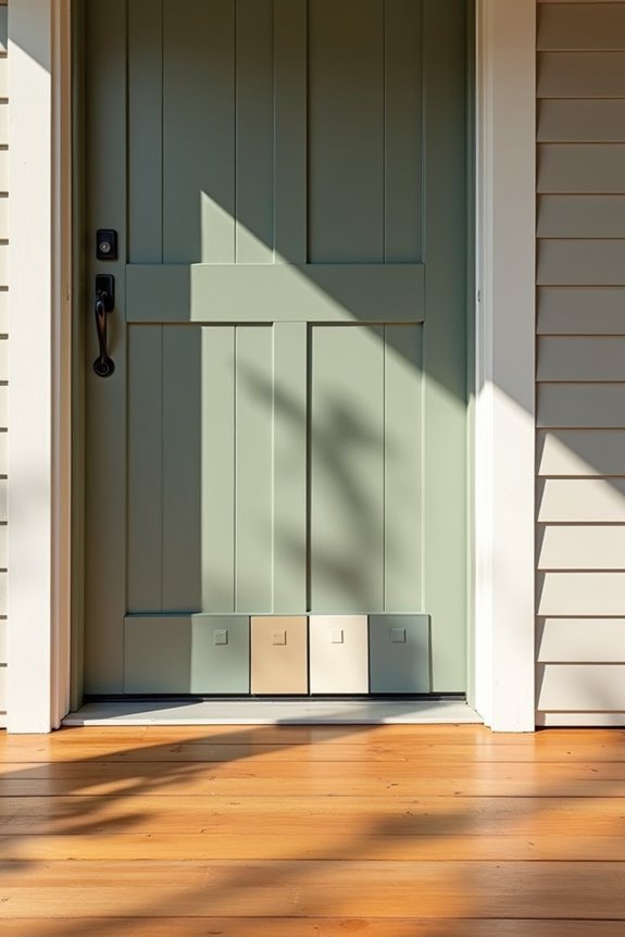
Before you commit to paint, grab some color samples and test them where they’ll actually live—on your porch, in your real lighting, at different times of day.
Color testing saves you from expensive mistakes. Paint a small section of your porch and observe it for several days. Morning light hits differently than afternoon sun, and that matters for porch color compatibility.
Take photos from various angles. Compare color samples against your siding and trim. This direct visualization reveals whether your choice harmonizes with existing tones.
I recommend visiting a local showroom too, like Keystone does, where professionals help you compare colors in-house. Small adjustments now prevent regret later. You’re building something you’ll look at every single day.
Common Porch Color Mistakes to Avoid
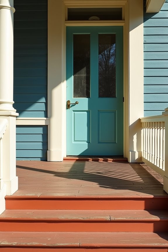
Now that you’ve tested your colors in real light, it’s time to look at what actually goes wrong.
I’ve watched homeowners make porch color choices that undermine their overall appearance. Here’s what to avoid:
- Matching your house exactly—it creates a flat, boring look without visual interest
- Going too dark or too light—harsh contrast feels heavy and unwelcoming
- Using too many colors—your trim, deck, and porch become a confusing mess
- Ignoring your landscape—colors that clash with surrounding plants feel disconnected
- Forgetting interior harmony—your porch should bridge indoor and outdoor spaces
The approach that works best? Aim for balanced contrast. Choose a porch color that complements, not copies, your house. This creates cohesion while adding depth. Your porch becomes a deliberate design choice, not an afterthought. That’s how you build appealing curb presence that shows careful planning.
Your Porch Color Decision Checklist
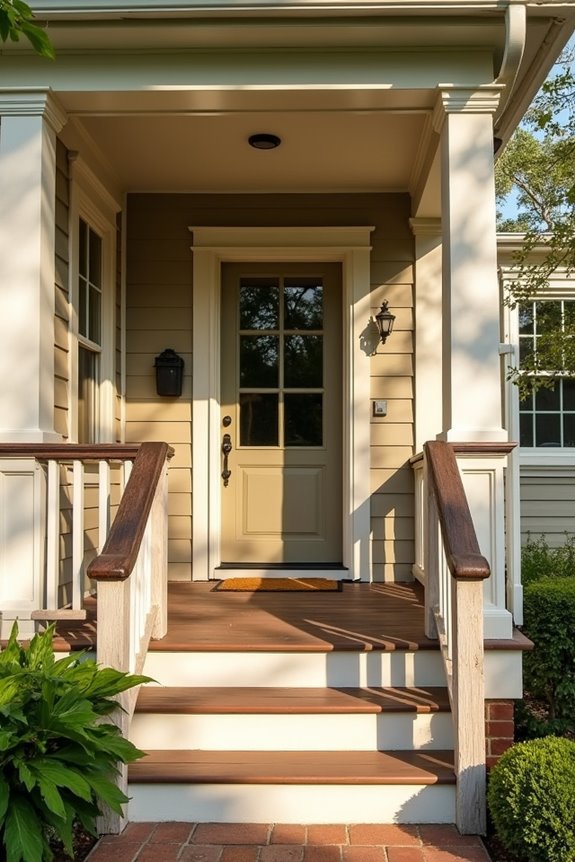
Ready to lock in your porch color choice? Let’s walk through this together.
Test your porch color against your house’s exterior. Does it feel like one cohesive space, or does it clash?
Gather inspiration. Take photos of your home from different angles, at various times of day. Notice how light changes your color perception.
Start neutral. I recommend beginning with softer tones to see what works before committing.
Check your color palette. Make sure your porch color, trim, and deck work together—not against each other.
Live with samples. Paint large swatches on your porch. View them from indoors and outside.
Ask yourself: Does this color harmony work for you? If yes, you’re ready to move forward with confidence.