
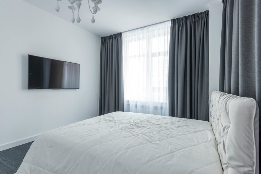
Start by thinking about your room’s purpose—warm colors like red or orange work well in entertaining spaces, while cool blues and greens suit bedrooms.
Next, follow the 60-30-10 rule: your walls form the foundation, curtains take up 30% of the visual space, and accessories complete the design.
Match or contrast your curtains with wall colors depending on whether you want a cozy feel or bright openness.
Test fabric samples in your actual room under different lighting to see how colors truly perform.
The details matter more than you’d think.
Choose Curtain Colors Based on Room Purpose and Mood
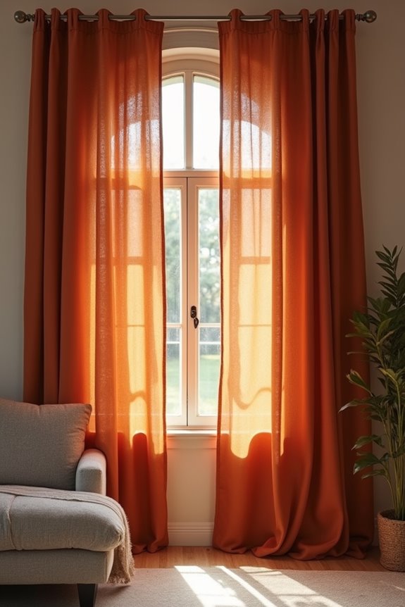
How do you want your space to feel? That’s where your curtain journey starts. I’ve learned that your room’s purpose shapes everything—the mood you’re creating, the light and brightness you need, even your fabric finish choice.
For entertaining areas, I reach for warm colors like red, orange, or yellow. They energize the space and invite people in. But in my bedroom, I go cooler—think blue, green, or purple. These colors calm me down after a long day.
Here’s my tip: match your wall colors with curtains that reinforce your goal. Pair sheer fabrics with light colors for brightness. Use matte finishes with darker shades for comfort. Your curtains aren’t just decoration; they’re your mood-setter.
Use the 60-30-10 Rule to Nail Color Balance
Ever wonder why some rooms look perfectly put-together while others feel like colors are fighting each other?
Ever wonder why some rooms look perfectly put-together while others feel like colors are fighting each other?
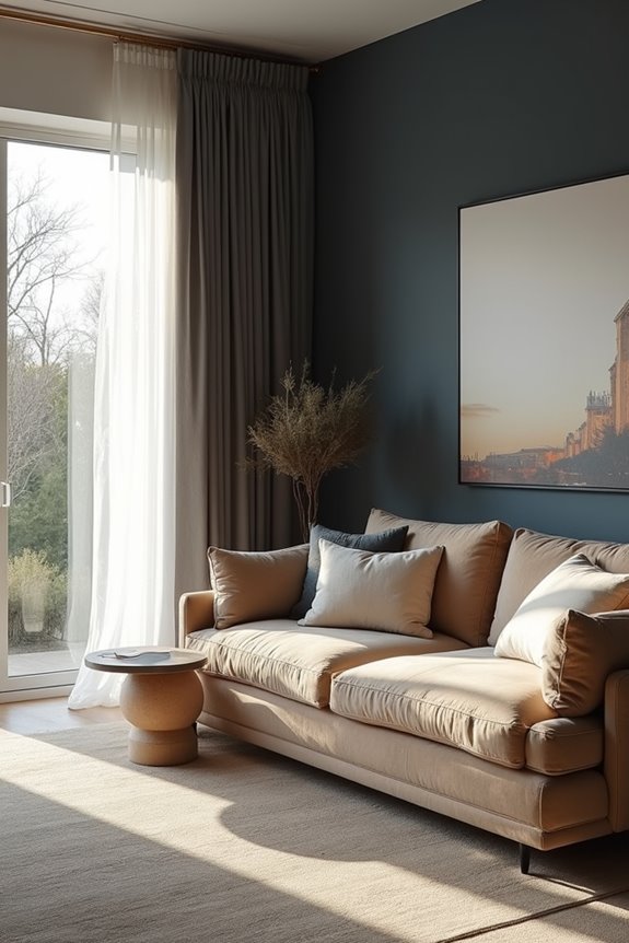
I’ll let you in on a designer principle: the 60-30-10 rule. Here’s how it works. Your walls take up 60% of the visual space, so they’re your foundation. Your curtain color claims the bold 30%—that’s where you anchor the whole look. Finally, small accessories round out the remaining 10%.
This formula creates a cohesive palette instead of chaos. When you choose a curtain color that complements your wall color, everything clicks together. You’re not overwhelming the room; you’re building harmony.
Start by picking your wall color first, then select a curtain color that works with it. Finish with accessories that echo both. This approach replaces guesswork with confidence.
Match Curtains to Your Wall Color
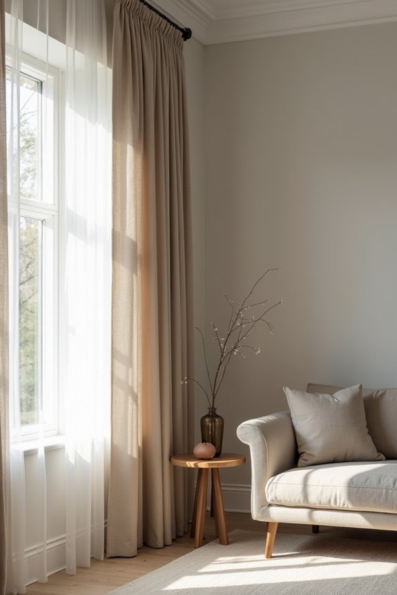
Your wall color sets the stage for everything else in your room, so matching your curtains thoughtfully—either by echoing that hue or deliberately contrasting it—matters. When you pick curtains that harmonize with your walls, you create a calm, cohesive feeling, but when you choose a contrasting color, you draw attention to your windows and make them a key design element. The trick is deciding whether you want your curtains to blend in and expand the space, or stand out and grab attention.
Contrast and Visual Impact
When it comes to making your curtains truly shine, the contrast between your wall and curtain colors is everything. I’ve found that understanding color contrast affects how your room feels and functions.
Here’s what I’ve learned about creating visual impact:
- Light walls with dark curtains make spaces feel cozy, though they reduce incoming light
- Dark walls with light curtains brighten rooms and make them appear larger
- White or light-grey curtains on white walls maintain crispness and simplicity
- Deeper, earthy tones on beige walls add depth and sophistication
The key to wall and curtain coordination is balancing boldness with harmony. When you create intentional color contrast, you’re not just decorating—you’re designing how light moves through your space. I encourage you to experiment with different combinations. Your perfect contrast exists, and finding it makes your room distinctly yours.
Harmony Through Color Coordination
While contrast gets all the attention, harmony is what actually makes a room work well and feel deliberately planned. I’ve found that mastering color coordination creates spaces where you feel comfortable and at ease.
The Rule of Three is a practical approach: 60% wall color as your foundation, 30% curtain color as your bold accent, and 10% small accessories to tie everything together. This formula creates balance without feeling boring.
When coordinating your curtain color with your wall color, you can either complement or contrast. Complementary colors create unity and calm energy, while contrasting choices add vibrancy. With white walls, pair soft grey curtains for crispness. On grey walls, try powder blue or silver curtains for sophistication.
Don’t forget texture—matte walls paired with slightly shimmery curtains add depth and dimension to your entire color scheme.
Pick Complementary or Analogous: It Depends on Your Vibe
How do you want your room to feel? That question guides your curtain color harmony choice. I’ve found that picking between complementary and analogous schemes shapes your entire room mood fixture.
- Complementary colors (opposite on the color wheel) create drama and energy—pick this when you want visual excitement
- Analogous colors (adjacent on the wheel) build calm, unified spaces ideal for retreats
- Lighting impact matters: brighter rooms handle bold complementary contrast better, while softer light suits subtle analogous palettes
- Balance matters: with complementary schemes, add muted accents; with analogous, vary tones and saturation to avoid a flat appearance
Your room’s purpose decides everything. Energetic spaces thrive with complementary color schemes. Bedrooms benefit from analogous approaches. Consider your lighting, your lifestyle, and honestly, how you want to feel when you’re there. That’s your answer.
Choose Light or Dark Curtains for the Right Effect
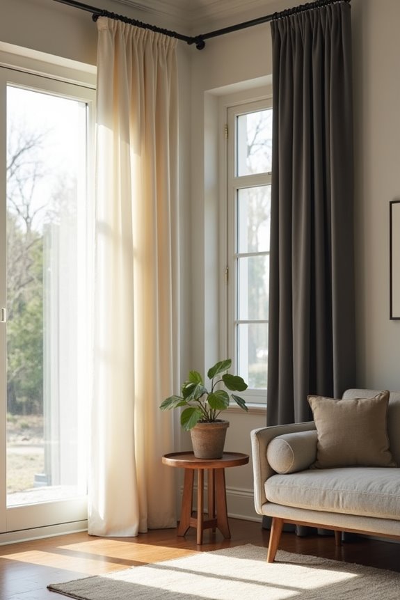
When I’m helping you pick curtain colors, I think about three big things: how big your room feels, how the fabric bounces light around, and what mood you’re going for. Light curtains? They’ll make a cramped or gloomy space feel larger and more open, while dark curtains turn a spacious room into an intimate space that feels enclosed. The trick is matching your curtain choice to your room’s size, your lighting situation, and whether you want that airy open vibe or something more intimate and warm.
Room Size and Brightness
Does your bedroom feel cramped, or does your living room seem too exposed? Your curtain color fixes this. Here’s how I’d approach it:
- Small rooms need light curtains – they bounce brightness around, making space feel bigger
- Large rooms welcome dark curtains – they create cozy intimacy and reduce that exposed feeling
- Match your walls – contrast between curtain color and wall shade affects perceived room size
- Consider your lighting – natural light and lamps change how colors read
Brightness matters more than you’d think. Shiny fabrics like silk reflect light differently than matte ones, so choose based on the effect you’re after. Light curtains work well for making tight spaces feel more open. Dark ones handle oversized rooms by creating a more intimate atmosphere.
Light Reflection and Fabric
Why does fabric matter just as much as color? Because your curtain’s sheen directly affects how light bounces around your space. Satin or silk-like fabrics reflect more light, brightening rooms. Matte textiles absorb light and create cozy intimacy.
Here’s how different fabric textures affect your room ambiance:
| Fabric Type | Light Reflection | Best For |
|---|---|---|
| Satin/Silk | High | Small, dark rooms |
| Linen | Medium | Balanced spaces |
| Velvet | Low | Warm, intimate feel |
| Cotton | Medium | Versatile rooms |
| Brocade | High | Luxury vibes |
Your curtain color works best when it aligns with wall color, preventing visual clash. Textural contrast—matte walls with shimmery curtains—actually strengthens dark color schemes. Match your fabric’s sheen to your room’s lighting needs, and you’ll achieve that perfect ambiance.
Mood and Ambiance Balance
Your curtain choices shape your room’s entire mood and ambiance. Here’s how to create the harmony you’re looking for:
- Choose light curtains to brighten small, dark spaces and make them feel open
- Pick dark curtains when you want luxury, warmth, and intimacy in your sanctuary
- Select soothing pastels like pale blues or greens for calming spaces that feel serene
- Balance your color choices with both natural and artificial lighting in mind
The right curtain color affects how you feel each time you step inside. You’re not just covering windows—you’re creating an atmosphere that welcomes you home.
Add Depth With Texture and Fabric Weight
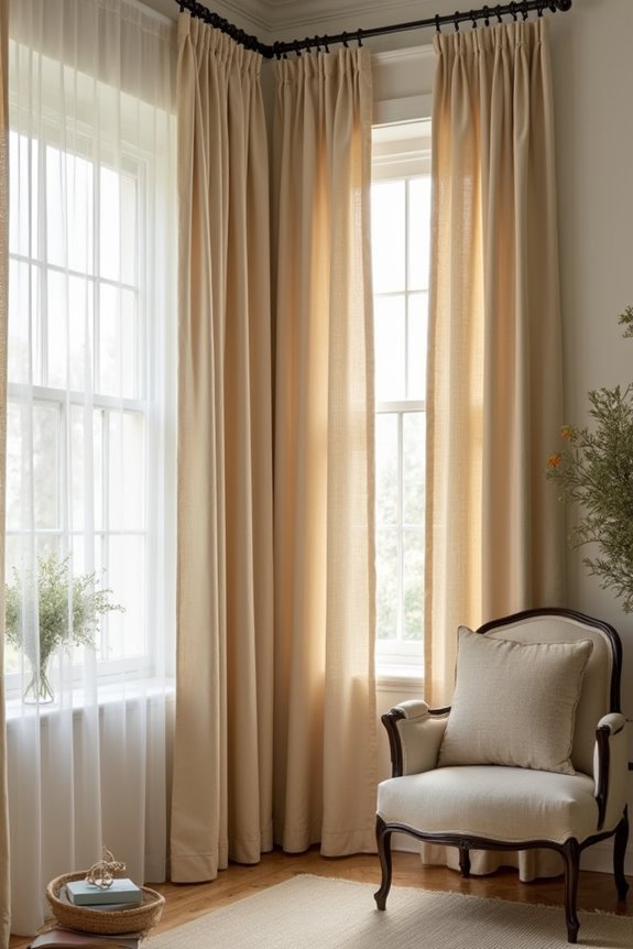
The fabric catches light differently, creating richer dimension and subtle shadows that make your color feel deeper and more luxurious than it actually is. Here’s what I’ve learned: heavier fabrics like velvet absorb light, intensifying your curtain color, while sheer materials reflect it, making colors appear lighter.
Match textures strategically:
- Pair matte walls with silk or velvet curtains for visual richness
- Layer different sheens—matte, satin, semi-gloss—to add interest without changing hues
Fabric weight and light sources interact throughout your day. Morning sunlight hits differently than evening lamps, shifting how your curtains’ color temperature and depth appear. This interplay lets you achieve sophisticated color impact without overthinking your choice. You’re building dimension through smart texture pairing.
Layer Patterns Strategically to Avoid Visual Conflict
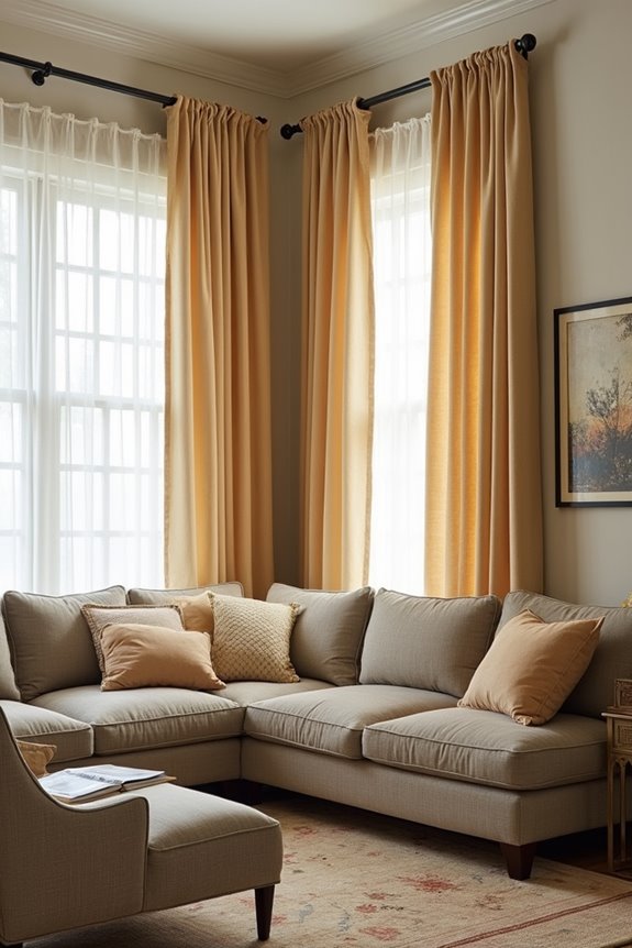
Once you’ve nailed your color and texture, patterns can either add visual interest or create visual chaos—and I’ve learned the hard way that layering them requires strategy.
Here’s how I keep pattern layering from overwhelming a room:
- Repeat a unifying accent color across printed curtains and solid drapes for instant cohesion
- Mix pattern scales (large with small) so motifs don’t compete for attention
- Balance bold patterns with solids in the same color family to maintain harmony
- Apply the Rule of Three: 60% wall color, 30% curtain color, 10% accessories
I’ve found that texture contrast—pairing matte bases with silk patterns—adds depth without visual conflict. This approach gives you color balance and scale variation without the headache. You’ll create a polished look that works well with your overall design scheme.
Coordinate Curtain Colors With Rugs and Key Furniture
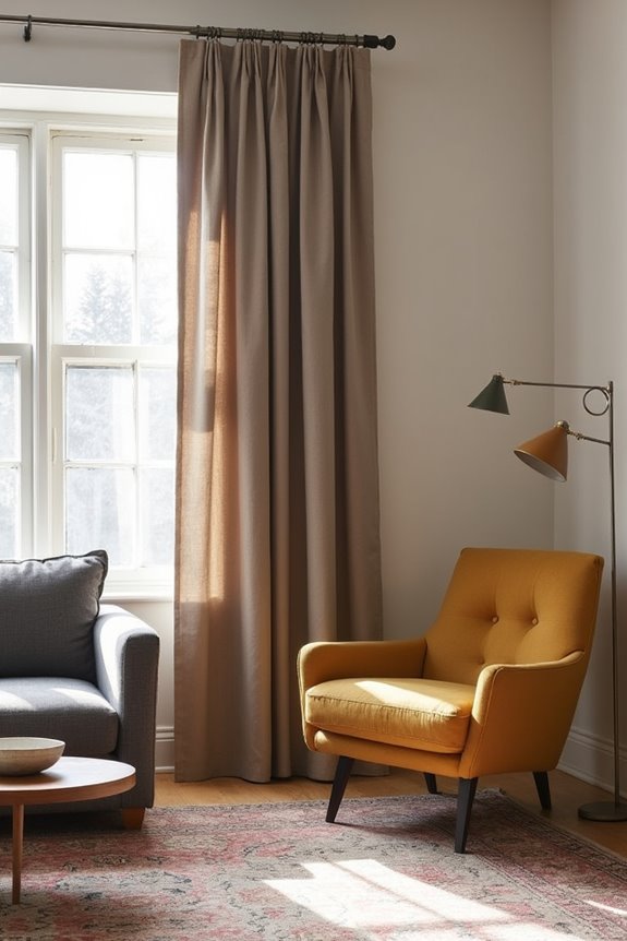
Now that you’ve mastered pattern layering, it’s time to expand your view beyond just the window. Your rug is your room’s anchor, so let it guide your curtain choices. I recommend starting your color palette balance from the floor up, then matching your curtains to that foundation.
Your rug anchors the room—build your curtain palette from the floor up for cohesive design.
Use the golden ratio: 60% primary color, 30% secondary, 10% tertiary. This formula keeps things balanced and deliberate.
Consider your curtain textures and sheen alongside your rug’s finish. Silk curtains paired with a matte rug? That contrast adds visual interest. You can create a room focal point via contrast by choosing bold color differences, or embrace harmonious tones for calm sophistication.
The key is treating your curtains and rugs coordination as a unified whole, not separate decisions.
Test Your Choices Against Real Fabric Samples
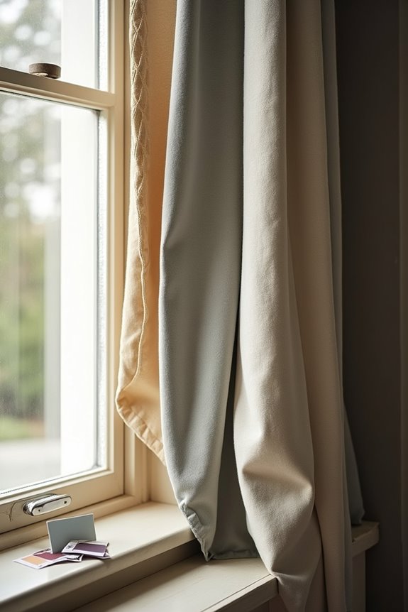
How confident are you that your curtain color will look right once it’s hanging in your actual room?
Colors shift dramatically depending on your lighting. Grab fabric samples and test them properly before buying.
- Compare swatches directly against your wall color, not on your phone or computer
- View samples during both daylight and evening artificial lighting to catch color shifts
- Hold samples beside your furniture and rugs to confirm color harmony
- Test at least 3–5 different fabrics to see how silk, velvet, and cotton affect room brightness differently
Different materials reflect light in unique ways. A velvet curtain absorbs light, making colors appear deeper. Cotton or linen lets more light through, brightening your space. Sample testing prevents expensive mistakes and builds your confidence. You’re not just picking a color—you’re creating the right fit for your room.