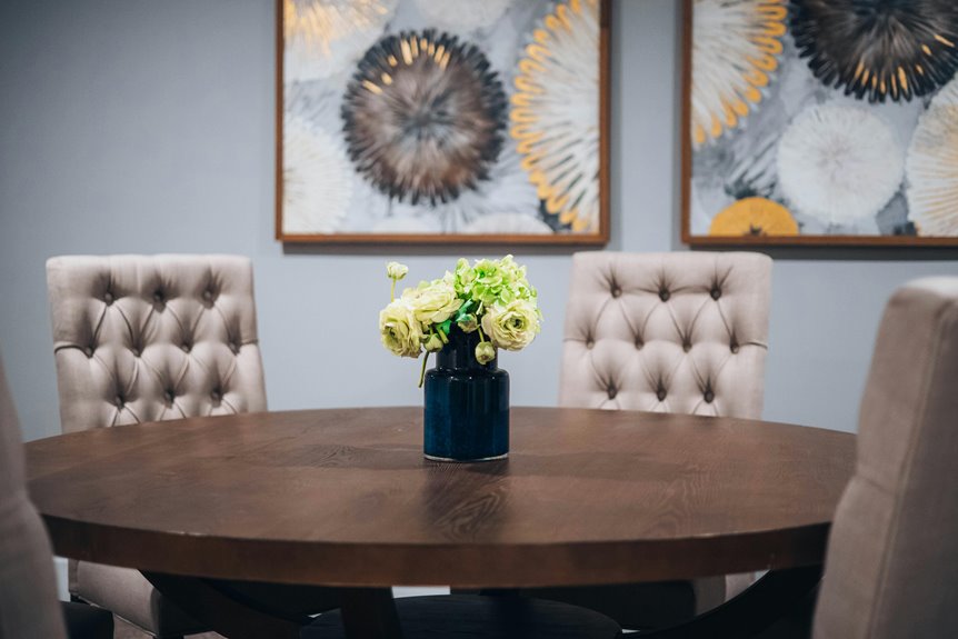
I’d fill a large wall by aiming for artwork that covers 60–75% of the space—not every inch. Grab one oversized piece for immediate impact, or mix frames in a gallery wall for flexibility. Mirrors bounce light and brighten things up nicely. Keep spacing intentional so your wall has room to breathe; blank space actually makes rooms feel bigger. Mount everything at eye level (57–63 inches from the floor) for balance. Thrifted frames and DIY art reduce costs without sacrificing style, and removable wallpaper lets you test bold ideas risk-free. Want to nail the specific measurements and layouts that work best for your space?
Start With Wall Scale: The 60–75% Rule
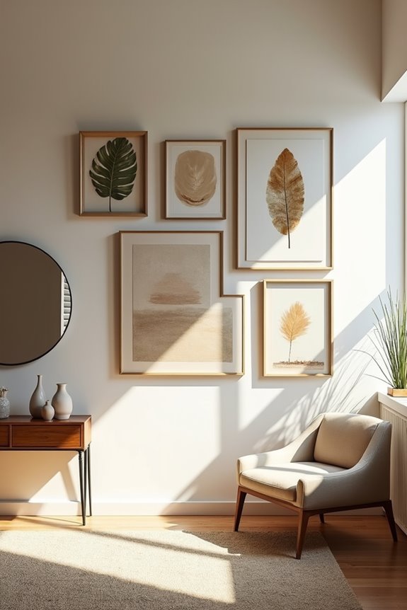
How do you know if your art’s the right size? I’ve learned that wall scale matters enormously. Here’s my rule: aim for art that fills 60–75% of your wall space. This creates a strong focal point without making your room feel cramped.
For oversized art, a single dominant piece delivers immediate visual impact. It’s the quickest way to address a large wall, though it can cost more. If budget’s tight, I consider multi-panel canvases that read as one cohesive work.
Alternatively, a gallery wall gives you flexibility. You can combine multiple pieces while maintaining that 60–75% coverage. The key? Keep everything proportional and intentional. When your art claims the right amount of space, your whole room feels complete and deliberately designed.
Use Oversized Art for Maximum Visual Impact
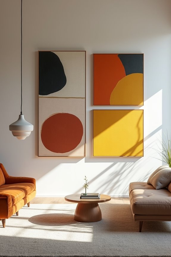
When you’ve got a wall that feels bare and endless, one large piece works well. Oversized art fills your wall space effectively, creating the visual impact you’re looking for. I recommend selecting a piece that claims 60–75% of your wall, which changes the entire room right away.
Here’s what I’ve learned: larger art pieces require investment, but you’ve got options. Consider DIY canvas art—it delivers substantial scale at a lower cost. When hanging above furniture, keep your oversized art between two-thirds and three-fourths of that piece’s width for balanced proportions.
Don’t forget stability either. I use corner brackets and proper hardware to secure everything safely. This approach keeps your piece firmly in place, giving you confidence in your design choice.
Design a Gallery Wall With Multiple Pieces
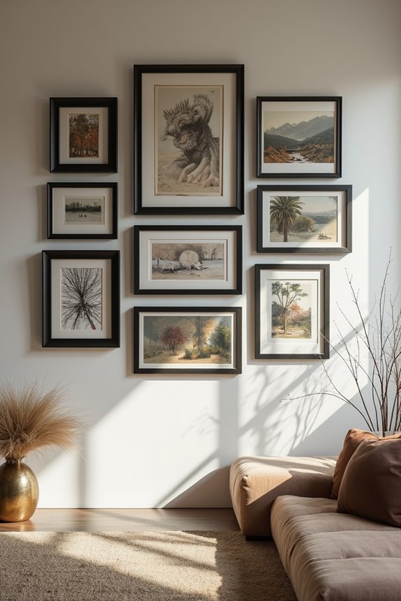
I’ll show you how to arrange multiple pieces so they work together as one cohesive display. You’ve got three big decisions to make: whether you want a clean grid pattern or a relaxed, mixed layout, how to mix different frame styles and art types without it looking chaotic, and how to balance your colors and spacing so nothing feels cramped or lonely. Let me walk you through each one, because getting these right makes a real difference in how your wall comes together.
Arranging Artwork In Grids
Why does a grid layout work so well for large walls? It brings order to your space. When you arrange wall art in a balanced grid, you’re creating organization that makes your space feel deliberate and welcoming.
Start by planning your spacing carefully. I recommend keeping consistent negative space between frames—this makes everything feel connected rather than scattered. Aim for your total artwork width to be about two-thirds to three-fourths of any furniture below it.
Place larger pieces at eye level as your anchor, then surround them with smaller works. This creates natural rhythm.
Pro tip: Use interchangeable frames or floating systems. You’ll update your grid anytime without starting over. That flexibility means your wall grows with you.
Mixing Media And Frames
Here’s where gallery walls get really fun—you can finally break the matching frame rule. I love mixing media and frames because it creates personality and movement. Combine photos, artwork, and decorative pieces together, then tie them visually through consistent matting colors or a unifying theme.
Your frame mix strategy:
- Pair bold pieces with simpler frames for balance
- Use different sizes and styles—wood, metal, colorful, minimalist
- Keep 60–75% of wall space for larger pieces
- Leave breathing room between items to avoid clutter
The key? Let your frames tell a story about you. Consider lightweight options like art rails for easy rotation when you want to swap family photos or kids’ masterpieces. Your gallery wall should feel deliberate, not random.
Balancing Color And Spacing
Once you’ve chosen your frames and media, the real design challenge kicks in: making sure your gallery wall doesn’t feel chaotic or cramped.
I’ve learned that spacing matters as much as what you hang. Here’s what I focus on:
- Use larger pieces that fill 60-75% of wall space when centered
- Leave generous negative space around each frame so nothing feels suffocating
- Build a cohesive palette through matching frame finishes or unified colors
- Alternate horizontal and vertical orientations for rhythm
The trick? Think of your gallery wall like a conversation—each piece gets its moment to shine without competing for attention. I deliberately embrace breathing room. It’s the empty space that actually makes your artwork look deliberate and polished, not cluttered.
Brighten Your Wall With Mirrors
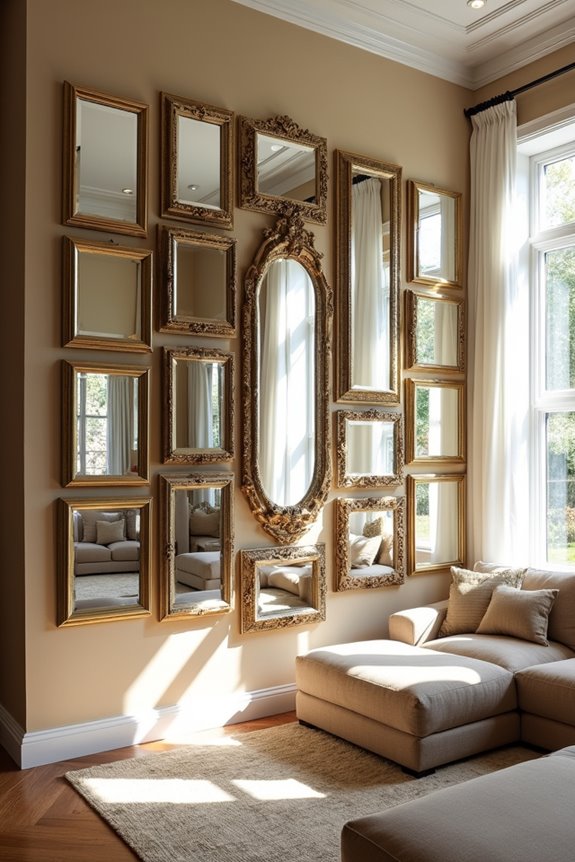
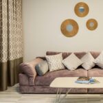
Mirrors are a decorator’s tool for brightening a blank wall. They bounce light around your room, making everything feel bigger and brighter. Group several smaller mirrors together to create a focal point on your large wall, which saves money while adding dimensionality.
Here’s what makes this approach work: mirrors reflect both natural daylight and ambient lighting, enhancing whatever illumination you have. You’ll appreciate the flexibility too—arranging multiple mirrors lets you balance wall proportions without committing to one heavy piece.
Pick frame finishes that match your furniture and architectural details for a cohesive look. Whether you hang them or lean them against the wall, your mounting hardware must support the combined weight. Your space will feel more open and welcoming.
Fill Your Wall With Shelving or Built-Ins
While mirrors brighten and expand your space, shelving and built-ins do something equally powerful—they give your large wall purpose and personality. I’ve found that wall shelving turns blank expanses into functional display areas where you can showcase what matters to you.
Wall shelving transforms blank spaces into functional display areas that showcase what matters to you, giving your large wall purpose and personality.
Here’s what I recommend:
- Choose shallow shelves (around 12 inches) that fit through openings without overwhelming your room
- Mix open shelves with decorative baskets for balanced, uncluttered storage
- Display art, plants, and collectibles that reflect who you are
- Consider modular systems for flexibility or built-ins for permanence
Built-ins require planning and measuring, but they’re worth the investment. Whether you go modular or permanent, display space turns your wall into a personal gallery that tells your story and creates the warm, deliberate home you want.
Layer With Tapestries, Wallpaper, or Murals
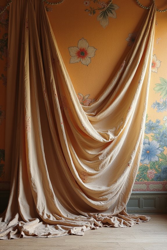
I’ve found that tapestries, wallpaper, and murals tackle two challenges at once: they add visual interest and dimension while creating a strong focal point that changes a room. You can test a pattern with removable peel-and-stick wallpaper before making a permanent choice, or commit fully with a mural that becomes your wall’s centerpiece. The best part is coordinating your choice with furniture and lighting you already have, so everything works together as one cohesive design.
Textural Warmth and Depth
How do you turn a blank expanse into something that feels alive and inviting? I’ve found that layered textures create the warmth your space needs. You don’t have to choose just one approach—combine them strategically.
Here’s how I build depth on large wall decor:
- Hang a tapestry as your foundation, adding soft texture and color
- Paint an accent wall behind it for contrast and dimension
- Install subtle molding to introduce hard surfaces
- Layer removable wallpaper in complementary patterns for visual interest
This mixing of soft and hard surfaces addresses bare walls without overwhelming your room. The key? Keep your color scheme consistent—neutral tones balance bold patterns well. You’re not just decorating; you’re creating a welcoming space that reflects your personality.
High-Impact Design Solutions
Want to refresh a blank wall quickly, without committing to permanent paint? Large-wall solutions like tapestries, wall-murals, and large-scale-wallcoverings deliver results fast. These options let you experiment boldly without regret.
| Solution | Setup Time | Permanence |
|---|---|---|
| Tapestries | 15 minutes | Removable |
| Peel-and-stick wallpaper | 30 minutes | Removable |
| Wall-murals | 1-2 hours | Semi-permanent |
Tapestries add texture immediately. Removable wallpaper lets you test patterns risk-free. Wall-murals create focal points that anchor entire rooms.
The approach? Pair one statement piece with minimal furnishings. This prevents visual chaos while maximizing impact. Choose colors that complement your existing furniture and lighting—you’ll create cohesion, not overwhelm. Start small if you’re nervous. You can do this.
Add Character With Molding and Trim
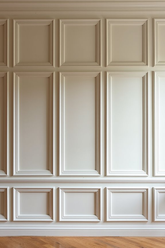
Dimension doesn’t always come from what you hang on a wall—sometimes it comes from the wall itself. I’ve discovered that molding and trim create character at a reasonable cost without requiring heavy artwork.
Here’s how I approach wall decor with trim:
- Board and batten trim adds dimension to large foyers or stairs for around $15
- Wainscoting molding boxes divide big walls into smaller, art-friendly sections
- Planked or shiplap walls introduce subtle lines and warmth without clutter
- Removable peel-and-stick wallpaper offers high-impact alternatives with less permanence
On textured walls like orange-peel surfaces, I test my decisions first using backer boards or caulk for better installation. This approach lets me experiment before committing. You’re building a space that reflects who you are, one thoughtful detail at a time.
Save Money With DIY Art and Thrift Finds
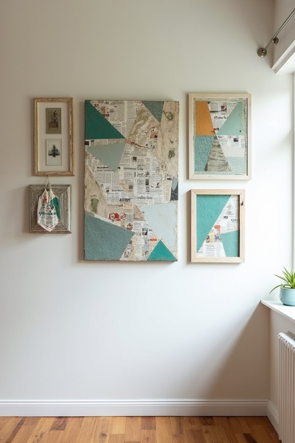
If you’ve been hesitant about big-wall decor because of the cost, here’s the truth: you don’t need expensive art to make an impact. I’ve discovered that DIY and thrift finds work beautifully on walls without draining your budget. Thrifted frames paired with prints you love create gallery walls at a fraction of retail prices. I assemble oversized DIY art using corner brackets—it’s secure, simple, and visually striking. Multi-panel canvas pieces let me scale up while keeping costs manageable. Removable wallpaper and murals offer bold focal points without permanent commitment. You’re not sacrificing style; you’re joining a group of smart decorators who understand that spending less doesn’t mean compromising on appearance. Your large wall can look gallery-quality and reflect what matters to you. Start hunting thrift stores this weekend.
Decorate Living Rooms, Dining Spaces, and Entryways
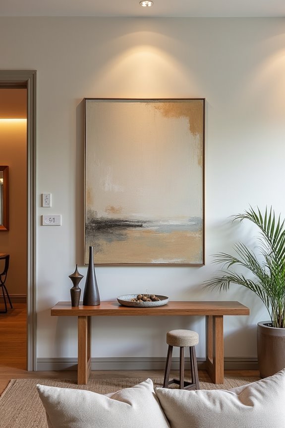
Where do you start when you’ve got a massive blank wall staring back at you? I’ll walk you through tackling large walls in your home’s main spaces.
A massive blank wall doesn’t need to intimidate you—strategic design choices transform it into your home’s focal point.
Consider these approaches:
- Living rooms: Hang oversized art or mirrors at two-thirds to three-fourths your furniture’s width
- Dining spaces: Create gallery walls that mix frames while maintaining balance and breathing room
- Entryways: Use lighting strategically—picture lights or wall sconces flanking art add depth and welcome
- Any room: Layer textural treatments like shiplap or board-and-batten for architectural interest
The key? You’re not filling every inch. Large walls work best when you’re deliberate about negative space. Lighting greatly enhances whatever you choose, drawing eyes exactly where you want them. Start with one approach, then build from there.
Align Wall Art With Furniture and Light
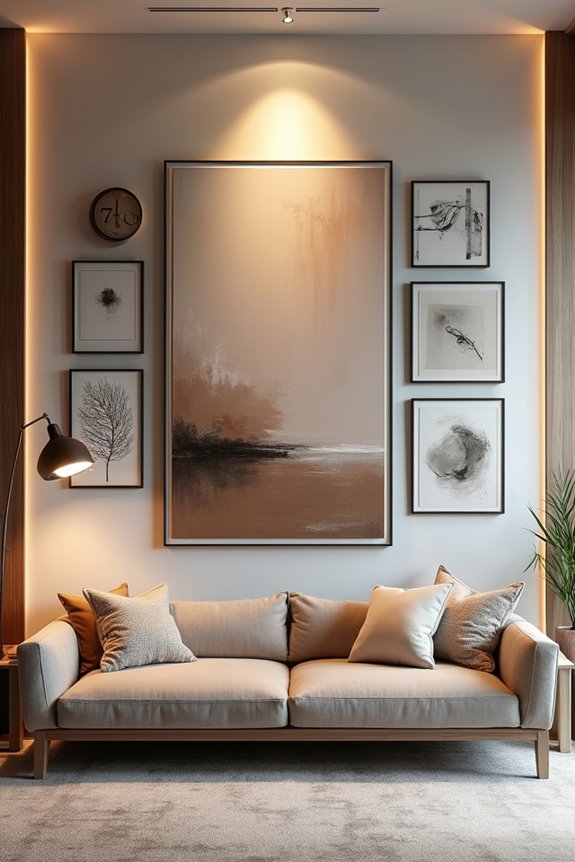
Align Your Artwork With Furniture and Light
Now that you’ve picked what goes on your wall, let’s talk about making it work with what’s already in your room.
Get Your Artwork Alignment Right
Size your art so it’s about two-thirds to three-fourths the width of the furniture below it. This creates a proportional relationship that makes your arrangement feel deliberate and planned.
Position for Perfect Viewing
Hang your pieces around 57–63 inches from the floor. That’s roughly eye level when you’re sitting, which means you’ll naturally see your art without craning your neck.
Integrate Lighting Smartly
Center sconces or picture lights directly with your artwork. This lighting integration prevents glare and highlights your wall art without overwhelming the space. You’re creating a complete, connected look that pulls the room together.
Leave Breathing Room: Why Blank Walls Work
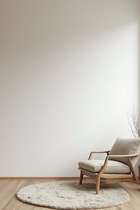
I’ve learned that the best large wall décor isn’t always about filling every inch—sometimes, what you *don’t* hang matters just as much as what you do. Blank space gives your eyes a place to rest, prevents that cramped feeling, and actually makes your art pieces stand out more, like they’re getting their own spotlight. When you step back and see breathing room around your pieces, suddenly the whole room feels calmer, more thoughtful, and honestly, more polished.
The Power of Negative Space
Ever notice how a single painting can feel lost on a huge wall, but move it somewhere smaller and suddenly it shines?
That’s negative space working its magic. I’ve learned that breathing room isn’t wasted space—it’s deliberate design. When you embrace empty wall areas, you create balance that makes your oversized wall feel purposeful, not bare.
Here’s what negative space does for you:
- Lets each piece stand out without competing for attention
- Reduces visual fatigue so your eyes can rest
- Improves how the whole room flows and feels
- Makes ceilings appear taller and the space airier
I used to think empty wall meant I’d failed at decorating. Now I see it differently. Strategic emptiness actually strengthens your design. It gives your artwork room to breathe, making your entire space feel more planned and welcoming.
Balance Over Full Coverage
Understanding negative space gets you halfway there, but here’s the real secret: the best-decorated walls aren’t always the fullest ones.
I’ve learned that balance beats clutter every single time. You don’t need to fill every inch of whitespace. Instead, think about scale and proportion. If you’re hanging artwork, aim for pieces that occupy about 60–75% of your wall, leaving breathing room around them.
Here’s what I recommend: choose 2–4 large pieces rather than cramming dozens of small ones together. This approach gives your eye a place to rest, making your room feel organized, not chaotic.
The real benefit comes when you resist the urge to fill silence. Strategic emptiness actually draws more attention to what you *do* display, creating impact through restraint rather than volume.
Visual Rest and Calm
Why do blank walls feel so good? They give your eyes a place to rest. When I fill every inch of a large wall, I actually make my space feel smaller and more chaotic. Consider a different approach instead.
Breathing room changes how your room feels. Here’s what I’ve learned works:
- Leave margins around artwork to maintain calm sightlines
- Skip covering every large wall—let some breathe
- Use simple treatments like soft color or molding instead
- Place one oversized piece rather than multiple busy displays
Strategic blank space improves perceived room height and prevents visual overwhelm. You’ll notice your favorite pieces stand out more when they’re not competing for attention. That’s the benefit of restraint.