
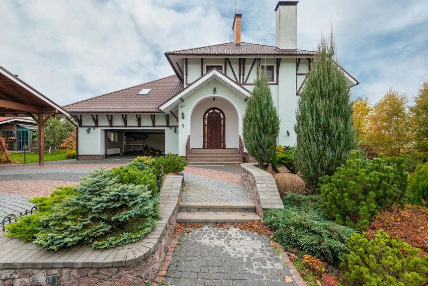
Your porch’s first impression matters, so start by decluttering and power washing everything. Paint your front door a bold color—think navy or red—to anchor your space. Pick two or three coordinating colors for your palette, then layer in seating, outdoor rugs, and varied planter heights to create warmth. Add layered lighting for evening appeal, and polish your house numbers and hardware finishes for cohesion. These strategic touches improve your entry into an inviting space that shows your home’s personality.
Start With a Clean, Decluttered Foundation
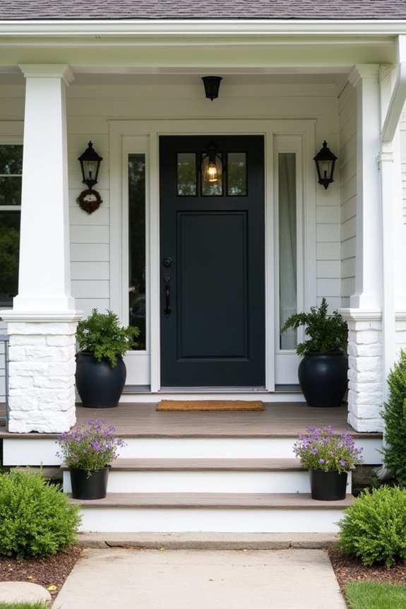
Why does your porch feel uninviting? Often, it’s because clutter and grime are taking up valuable space. I’ve found that thorough cleaning sets the real foundation for porch design.
Here’s what I do: First, I declutter by removing old furniture and unused decor. This gives me a fresh base to work with. Next, I sweep and power wash everything—the floor, railings, surfaces. The space feels noticeably different afterward.
Then, I eliminate anything blocking movement or functionality. Those stray planters? Gone. Broken chairs? Removed. A clear porch functions better and feels more welcoming.
Before you paint, add plants, or hang décor, establish this clean foundation. It creates a solid backdrop where your new design choices work effectively and invite people in.
Paint Your Front Door in a Bold, Coordinating Color
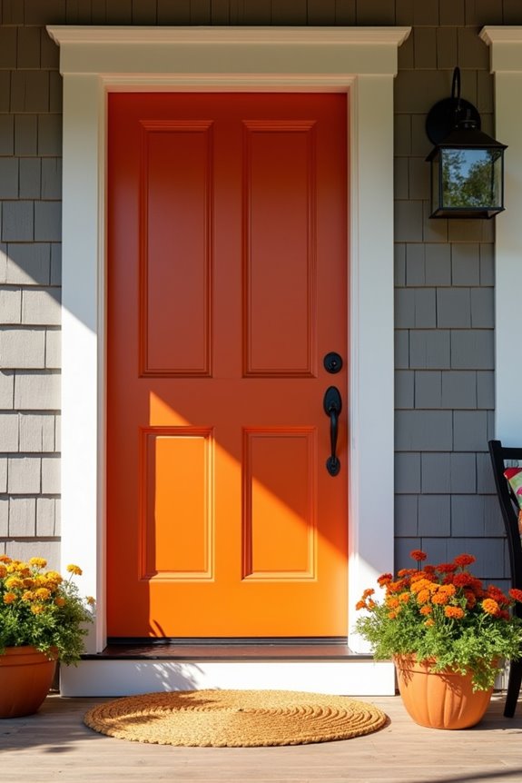
Now that your porch is clean and clutter-free, it’s time to make a real statement. I’m talking about your front door color—it’s your home’s biggest welcome sign.
A bold color refreshes your curb appeal right away. Consider red, navy, or black to complement your house’s exterior palette. These bold color choices create a strong visual anchor that catches every visitor’s attention.
Here’s what you need to know: exterior paint costs about $35 per gallon, so budgeting’s straightforward. The real work happens with proper surface preparation—clean, sand, and prime your door first. This helps your paint last longer and look even.
Your freshly painted door becomes a visual invitation, brightening your entire entryway. You’re not just refreshing a door; you’re creating a sense of belonging, telling visitors they matter. That’s the power of an intentional front door color choice.
Establish Your Porch’s Color Palette Before Adding Decor
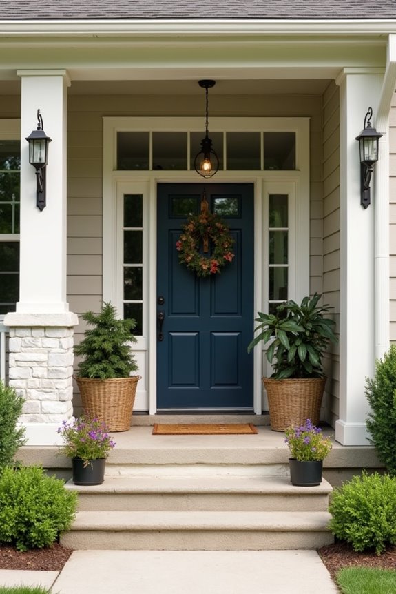
Before you hang a single wreath or place a single planter, pick your porch’s color palette—it’s the foundation that makes everything else work together. Limiting yourself to just two or three colors, like pairing a bold door with your home’s trim and one accent shade, creates a polished look. Once you’ve decided on your colors, every choice becomes easier: your planters, cushions, and lighting naturally fall into place because they’re all using the same visual language.
Complementary Color Combinations
How you color your porch sets the entire mood for your home’s exterior appearance, and I’ve found that nailing this step first makes everything else fall into place.
I recommend choosing two or three colors maximum. Here’s what works: pick a main trim color, add a lighter or darker shade for depth, then introduce one bold accent. Your front door color becomes the focal point—think deep navy, forest green, or rich burgundy. Keep your siding and trim similar so they don’t fight for attention.
Now coordinate everything. Your shutters, railing, posts, and garage door should echo these tones. This coordinated palette ties your porch together visually. Even small exterior accents like planters and lighting reinforce this scheme.
The key? Balancing bold with subtle. Your striking door draws attention while harmonizing tones create visual cohesion without clashing.
Coordinating With Existing Elements
Once you’ve locked in your color scheme, the real work begins—making sure those colors actually work with what you’ve already got. Your front door color should complement your siding, not clash with it. I’ve found that matching your coordinated palette to existing trim, railings, and shutters creates a polished look.
Here’s how I approach it:
- Photograph your home’s current exterior in natural light
- Hold paint samples against siding, doors, and architectural features
- Check how colors look at different times of day
- Paint small test patches before committing to full projects
Your exterior color scheme ties together when each element respects what’s already there. This isn’t about hiding your home’s character—it’s about amplifying it. When your porch coordinates with existing details, everything looks deliberate and thoughtful.
Limiting Your Palette Selection
Why do some porches feel so satisfying to look at, while others seem visually chaotic? The answer’s simpler than you’d think: restraint. I’ve learned that establishing a strong porch color palette means choosing just two or three colors maximum. Here’s my approach: pick one trim color, add a lighter or darker shade for dimension, then introduce one bold accent door that commands attention. This strategy creates a cohesive exterior that appears deliberate rather than random. When I limit my selections, every element—shutters, railings, planters, lighting—falls into place naturally. The result? A harmonious front entrance that welcomes people in. You’ll find that fewer colors actually create more visual interest because nothing competes for attention. Start by identifying your siding color, then build around it. Your porch will benefit from this approach.
Choose Seating That Invites Guests to Linger
Your front porch becomes a real gathering spot when you’ve got comfortable seating waiting there. I’ve found that the right porch seating makes your space inviting and welcoming.
For smaller porches, I recommend considering these compact seating options:
- Bistro sets with two chairs and a small table
- A single statement chair paired with a side table
- A narrow bench against the wall
- Stacked seating that stores easily when not in use
The key is choosing inviting seating that doesn’t overwhelm your porch. I select weather-resistant outdoor furniture that holds up to the elements while maintaining that welcoming feel. When guests see comfortable, quality seating, they’re more likely to linger. This simple choice tells visitors they’re valued, creating that sense of belonging we all crave on our front porches.
Layer Outdoor Rugs and Cushions for Comfort
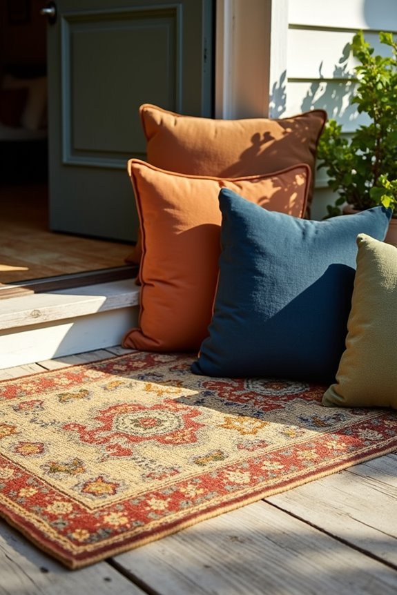
Once you’ve got your seating in place, it’s time to make it even more inviting with layers of texture and comfort. I recommend starting with a larger outdoor rug—not a small doormat—to anchor your seating area and create a defined zone. This immediately signals to visitors that they’re entering a welcoming space.
Next, add cushions in weatherproof fabrics that coordinate with your planters and lighting. Layering different textures on your porch creates visual interest and depth. Choose durable, weather-resistant materials so your outdoor rugs and cushions actually survive rain and sun without fading or falling apart.
The combination of soft textures underfoot and comfortable seating cushions makes guests want to stay longer, turning your porch into everyone’s favorite gathering spot.
Select Plants That Bloom Throughout the Year
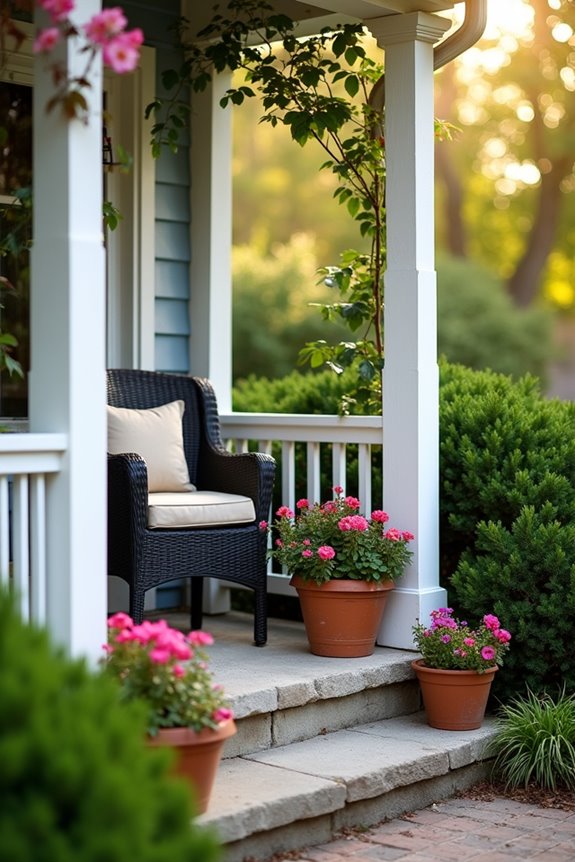
Plants that bloom at different times of the year will keep your porch looking fresh from January through December. Layering blooms works well, and you don’t need a green thumb to pull it off.
Here’s what I recommend:
- Spring bloomers like daylilies add cheerful color when everything’s waking up
- Summer favorites such as black-eyed Susans provide consistent, reliable flowers
- Fall options including rosemary offer texture and interest as temperatures drop
- Year-round structure from conifers keeps your space looking intentional even in winter
Mix these together, and your porch becomes a gathering spot across seasons. Water new plantings frequently that first year, then fertilize in spring and fall. Choose drought-tolerant varieties if maintenance feels overwhelming. You’ll feel satisfied watching your space develop monthly.
Arrange Planters for Height and Visual Interest
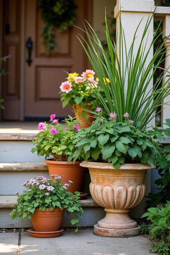
How do you make a small porch feel bigger and more dynamic? I’ll tell you—it’s all about arranging your planters strategically.
Create Dimension With Height
I vary my planter sizes, pairing tall containers with smaller pots. This layering adds visual interest and makes the space feel more purposeful. The height difference draws your eye upward, creating the illusion of more space.
Balance With Symmetry
I place matching planters on either side of my door. This symmetrical arrangement frames the entry beautifully, improving curb appeal while making my home feel welcoming. It’s an easy way to add polish without much effort.
The Results
This simple approach works well on my porch. The varied heights, balanced planters, and lush greenery work together, improving my home’s appearance. You’ll notice the difference right away.
Add Warmth and Glow With Layered Outdoor Lighting
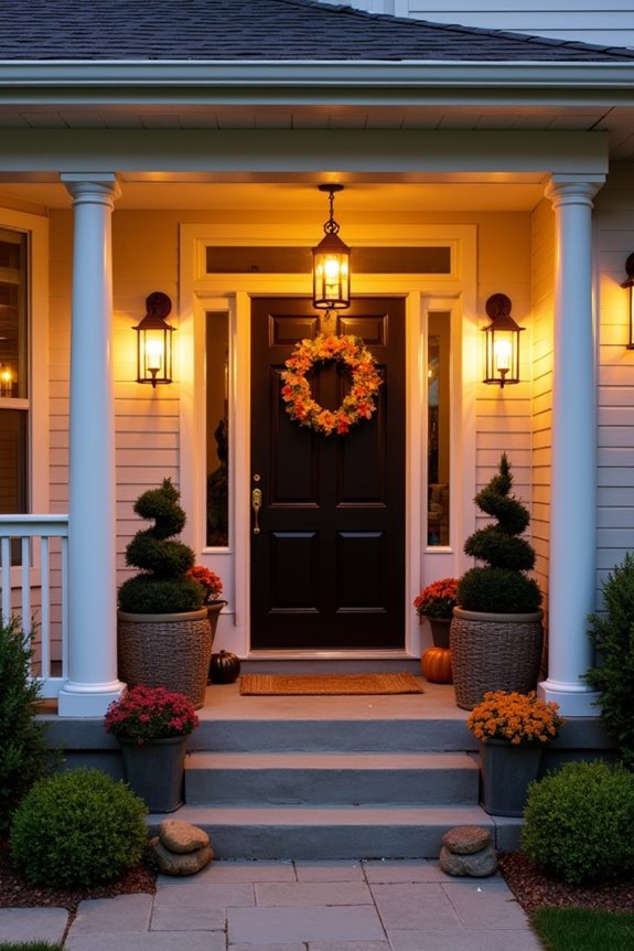
I’ve found that layering your outdoor lighting—mixing ambient, task, and accent fixtures—creates an inviting and dimensional front porch after sunset. Strategic placement of lanterns near the entry, sconces along pathways, and subtle accent lights on architectural features guides visitors’ eyes while keeping them safe. This approach to evening outdoor lighting doesn’t require expensive overhauls; it’s really about choosing durable, weatherproof fixtures that match your home’s style and coordinating their warm glow with your overall design palette.
Layered Lighting Strategy
When the sun dips below the horizon, your porch shouldn’t fade into darkness—that’s where layered lighting comes in. Combining different light types creates depth and warmth on your porch while keeping it safe and visually interesting.
Here’s how to approach layered lighting:
- Ambient lighting – Install overhead fixtures or lanterns that bathe your entire porch in soft light
- Task lighting – Place sconces near your door and along walkways so you can see where you’re going
- Accent lighting – Use spotlights to highlight architectural details, plants, or decorative elements
- Pathway lights – Line walkways with low-level fixtures that guide visitors toward your entrance
This strategy isn’t complicated. You’re simply creating multiple light sources at different levels and intensities to make your home look well-considered and welcoming after dark.
Evening Curb Appeal Enhancement
Why does your porch disappear the moment the sun sets? Without proper exterior lighting, you’re missing out on showcasing your home’s best features after dark.
I’ve found that layered porch lighting creates an inviting entryway. You’ll want to combine different fixture types—wall sconces, lanterns, and step lights—to create depth and warmth.
Here’s what works: position lights along pathways to guide visitors safely. Highlight architectural details that make your home unique. Choose fixtures matching your home’s style, using weatherproof materials for durability.
Pay attention to light temperature. Warm tones coordinate beautifully with most exterior palettes, creating that inviting glow you’re after.
Your curb appeal shouldn’t vanish at dusk. Strategic exterior lighting welcomes people and makes them feel they belong.
Highlight House Numbers and Porch Trim Details
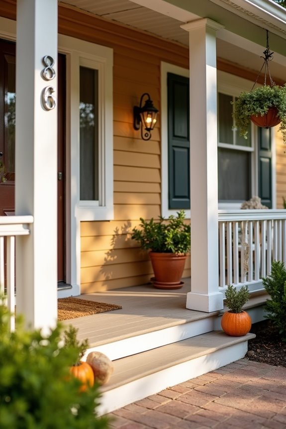
Your house numbers are one of the first things visitors notice, yet many homeowners overlook them as a design opportunity. I’ve learned that upgrading your house numbers and porch trim improves your curb appeal.
Here’s what I recommend:
- Choose a modern style that contrasts with your exterior for maximum visibility
- Match the finish to nearby exterior lighting for a polished look
- Select numbers harmonizing with your home’s architectural style
- Coordinate everything—numbers, trim, and decor together create a unified presentation
Simple numbers start around $2 each, while customized plaques run $50–$100. The investment pays off. I’ve noticed that when house numbers and trim details work together, your porch has a well-designed quality that welcomes visitors.
Polish Hardware and Finishing Touches for a Cohesive Look
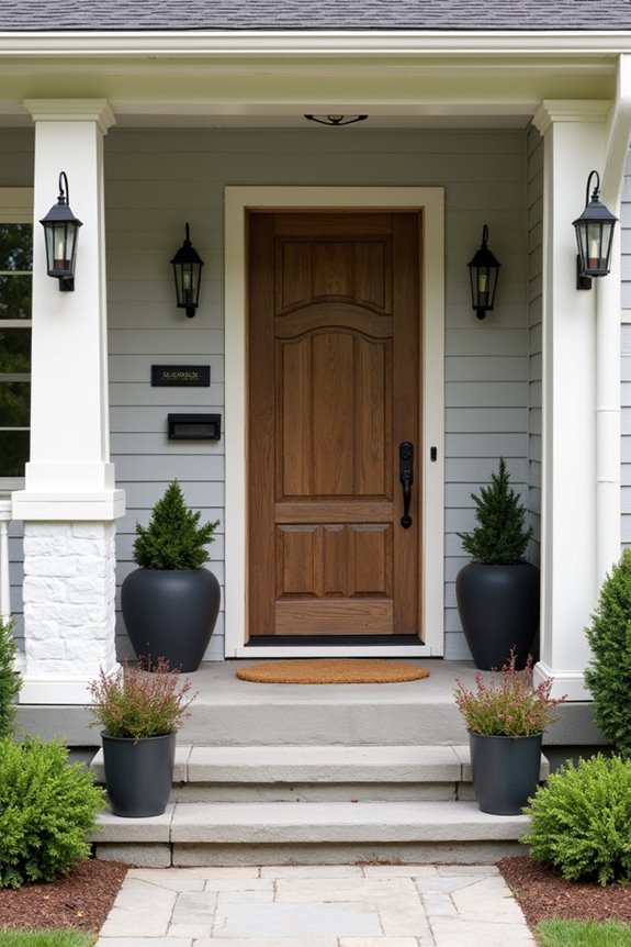
I’ve found that matching your hardware finishes—like doorknobs, hinges, and light fixtures—creates a deliberate appearance that ties your whole porch together. When I choose one metal tone, whether it’s brushed nickel, matte black, or warm brass, it signals that I’ve considered every detail rather than assembled things haphazardly. These unified finishing touches are what distinguish a porch that looks well-designed from one that appears pieced together without much thought.
Hardware Finish Coordination
Have you noticed how mismatched door handles, light fixtures, and house numbers can make even a beautiful porch feel scattered?
I’ve learned that coordinating your front door hardware, exterior lighting, and house numbers creates a cohesive, polished feeling. Here’s what I recommend for solid finish coordination:
- Choose one primary metal tone—brass, matte black, or brushed nickel—and commit to it
- Match your door handle, house numbers, and mailbox hardware to this finish
- Select exterior lighting fixtures that echo the same metal tone
- Reserve subtle contrast only where necessary, like pairing brushed nickel with oil-rubbed bronze accents
When you decide on your finish color first, everything else falls into place naturally. You’ll notice how these small touches create a unified, polished entryway that works well together and makes guests feel welcomed.
Cohesive Metal Selections
The appeal of a polished porch comes down to choosing metals that work together and actually last. Selecting one metal family—brushed nickel, matte black, or stainless steel—creates consistency across your hardware, lighting, and decorative accents. This unified approach gives your entryway a purposeful quality that shows careful planning.
When planning your metal palette, consider weatherproof finishes that resist tarnishing. Coordinate your door handles, house numbers, mailbox hardware, and railing accents so they complement each other beautifully. Before replacing any pieces, map out your metal selections first. This allows new components to integrate smoothly with existing architectural features.
A cohesive metal strategy is straightforward design that keeps your porch looking polished season after season.
Unified Exterior Details
Ever notice how a front porch looks well-coordinated when everything matches? I’ve learned that unified exterior details improve your home’s first impression. You want your front door color, hardware, and fixtures working together, not competing for attention.
Here’s what I focus on:
- Match your hardware finishes across door handles, mailbox, and lighting fixtures for a polished appearance
- Choose a cohesive color palette using two or three colors maximum—one main trim color plus accents
- Coordinate exterior lighting with your overall scheme, ensuring fixtures complement your front door color
- Touch up regularly to maintain shine and protection on doors, trim, and railings
When I keep these elements consistent, my porch looks deliberate and welcoming. You’ll notice how hardware consistency alone makes everything look designed rather than random. That’s what happens when you treat your home’s details as a coordinated system.