Start with one strong focal point—a large artwork spanning two-thirds your couch’s width creates immediate visual impact.
Layer in texture, color, and pattern through complementary pieces.
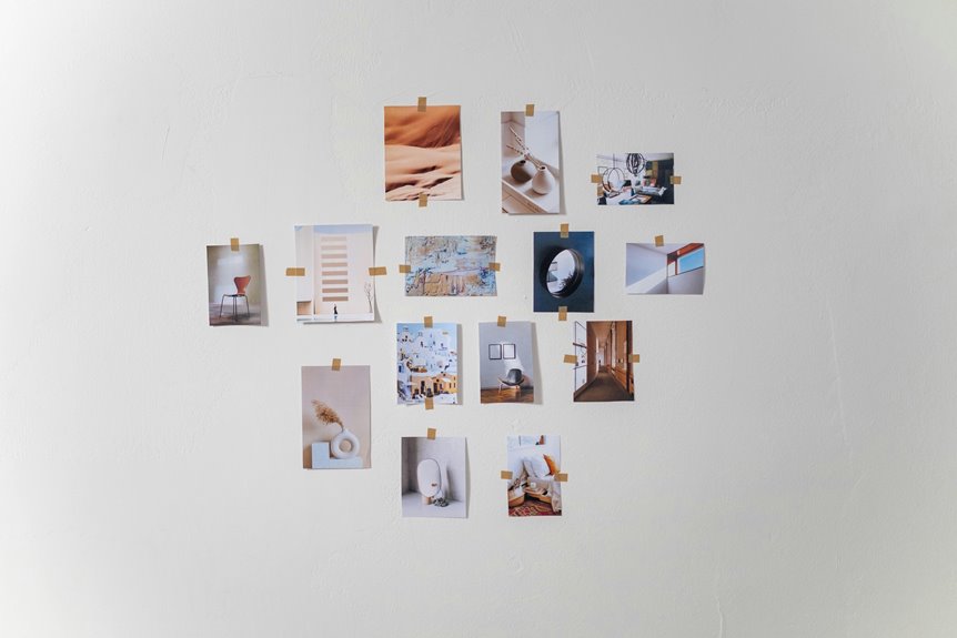
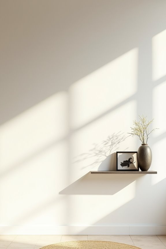
Position gallery walls or floating shelves to showcase personal items and family photos in cohesive frames.
Add picture lighting for drama, incorporate plants for freshness, and consider architectural details like painted arches.
These deliberate choices work together to create a space that reflects your individual style and preferences.
Choose Your Blank Wall’s Focal Point
How do you turn an empty wall into something that actually matters? Start by selecting one strong focal point that commands attention.
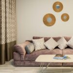
I recommend choosing a single large-scale piece that spans about two-thirds of your couch width. This creates balanced visual footprint without overwhelming the space. If you prefer two artworks instead, keep them no more than 4 inches apart so they read as one cohesive unit.
Consider proportion carefully—it’s what separates deliberate design from random decoration. Add lighting that spans roughly two-thirds of your wall art’s width to enhance the piece and draw eyes exactly where you want them.
This foundation creates your blank wall into a gallery wall with real purpose.
Size and Position Large-Scale Art
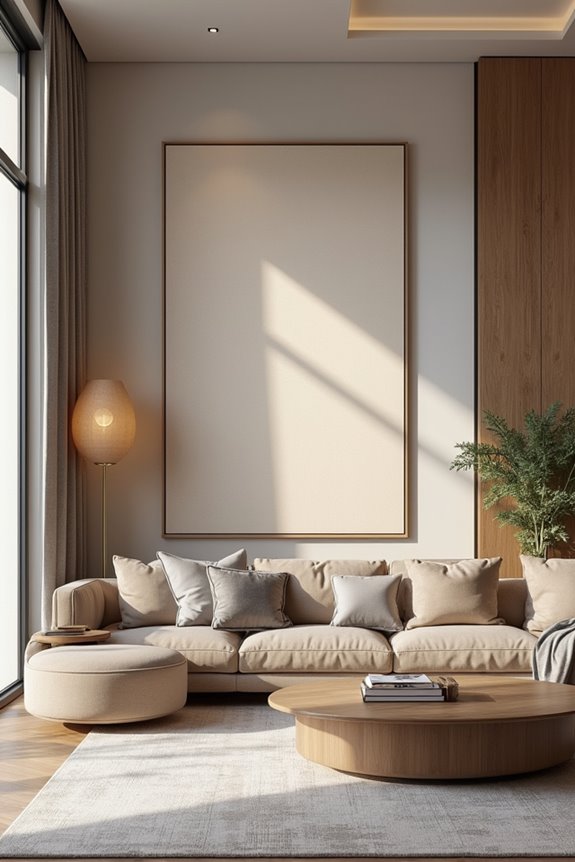
Now that you’ve chosen your focal point, it’s time to think bigger—literally. Large-scale art should occupy at least two-thirds of your couch width to create a cohesive unit. This coverage gives you visual impact and makes your wall area feel planned, not empty.
Position your art directly above the couch—this is prime real estate. If you’re hanging two vertical pieces, keep them no more than 4 inches apart for a unified gallery effect. For a single horizontal piece, add a picture light spanning two-thirds of the art width. This balances wall proportion and illuminates your work well.
The goal? Make your wall proportions work *with* your seating, not against it.
Layer Texture, Color, and Pattern
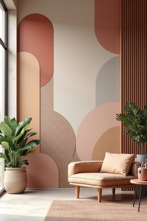
While a single large artwork creates impact, layering texture, color, and pattern builds depth into your wall. Combining wall treatments—think wood slats, 3D plaster, or fabric panels—adds physical dimension that draws attention. Here’s what works: pair textured surfaces with bold color or patterned art to avoid flatness. Use textured wall panels as your focal point, keeping surrounding decor minimal so nothing competes. Balance multiple textures by repeating one color palette across art, textiles, and accessories. Consider running horizontal board-and-batten with large artwork beside it—this reads as one cohesive statement. The key to successful art placement? Let texture do the heavy lifting while minimalism keeps things from feeling cluttered. You’re building a feature that belongs in your space.
Display Personal Style Through Shelving and Gallery Walls
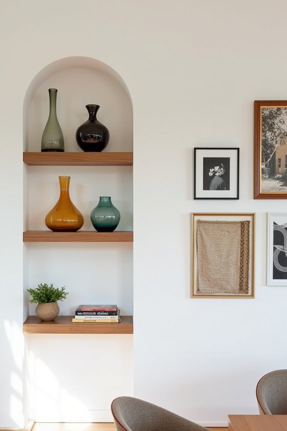
Why settle for blank wall space when you can fill it with the things that actually matter to you?
Gallery walls and floating shelves use empty spaces to display what you value. Start by arranging family photos in black-and-white frames, spacing them no more than 4 inches apart so they read as one unit. Mix different frame sizes and orientations while maintaining a cohesive color palette—this keeps everything looking organized and deliberate.
| What to Display | Why It Matters | How It Feels |
|---|---|---|
| Family photos | Tells your story | Connected |
| Curated books | Shows your interests | Authentic |
| Plants & collectibles | Adds life & texture | Welcoming |
Layer in floating shelves for texture, storytelling, and organization. Add clipboards or hanging clip frames for easy-updating without repositioning everything. This flexible approach lets you refresh your personal style whenever inspiration strikes, while shelving keeps display clutter hidden but accessible.
Add Plants and Nature to Your Wall
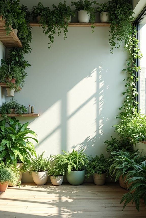
Pair real plants alongside botanical prints. Your wall becomes a calming focal point that communicates comfort and belonging.
Light Your Wall for Maximum Impact
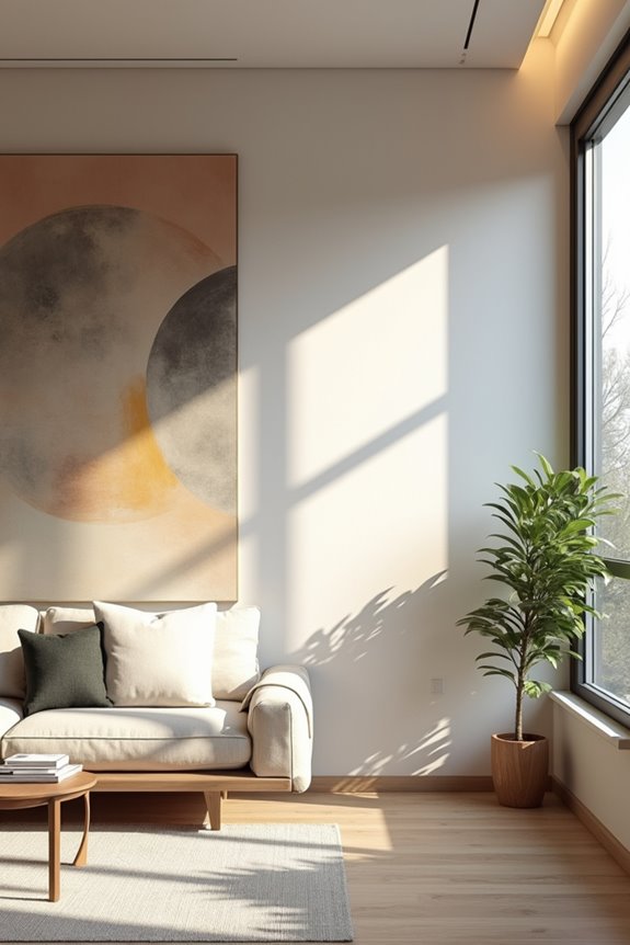
Good lighting can change even the simplest wall into something that captures attention.
Picture lights are highly effective. I position them to span about two-thirds of my art display’s width, creating balanced illumination that highlights the center without causing glare on glass surfaces. For a gallery wall, I use one continuous light across the combined width.
Spacing matters too. When I hang two vertical pieces, I keep them no more than four inches apart so they read as one cohesive unit.
Don’t forget to adjust your brightness based on time of day. Dimmable options let me shift the mood from energizing morning light to cozy evening ambiance.
This simple step changes my wall decor from ordinary to memorable.
Create Architectural Detail Without Renovation
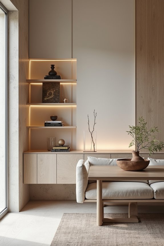
I’ve discovered that you don’t need a contractor to add real architectural interest to your blank wall—painted arches, bold color blocks, and geometric cutouts work effectively. These techniques create depth and visual movement that make the eye perceive a more complex, deliberate space. Here’s how to achieve these looks with paint and thoughtful styling.
Painted Arches and Color Blocks
Want to add real architectural character to your space without calling a contractor? Painted arches and color blocks turn blank walls into focal points. I create architectural depth by outlining curved openings with contrasting borders, immediately enhancing any room.
Here’s my approach to making this work:
- Choose complementary tones like warm neutrals paired with bold accent shades for visual interest
- Size matters—span arches across 60–70% of your wall width so they feel deliberate, not overwhelming
- Use matte finishes on arches to reduce glare and enhance perceived depth against glossy walls
- Coordinate with existing décor by matching arch colors to your furnishings, creating a cohesive palette
Color blocks define zones and add personality through spatial zoning. I tie everything together through thoughtful wall color coordination, so my wall treatments feel connected to the room’s overall design rather than randomly placed.
Geometric Shapes and Cutouts
How can you add depth and visual interest to a flat wall without breaking through drywall or hiring contractors? Install geometric shapes and cutouts. I recommend mixing circles, squares, and hexagons in a deliberate gallery arrangement that reads unified, not random. This creates visual rhythm and sectional separation between spaces.
Pair your geometric shapes with complementary vases and furnishings to reinforce your design language. Think circular cutouts paired with round planters or hexagonal shelves beside geometric artwork.
Keep your neutral wall color and restrained artwork balanced—this prevents overwhelming the room. These architectural silhouettes work as transitional features between rooms, enhancing depth and flow naturally. You’re creating architectural detail without renovation, turning your blank wall into a unified design statement that invites people in.