
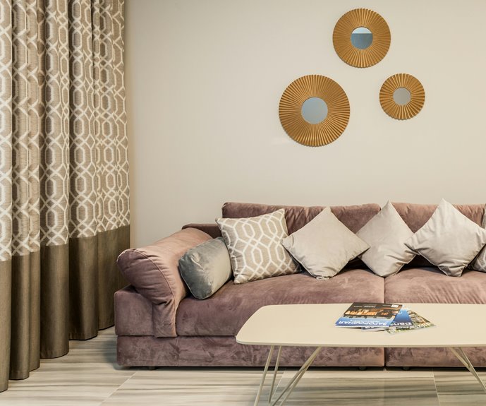
It’s totally your call. Darker curtains anchor rooms and add drama, while lighter ones expand your space and bounce light around. What matters most is your room’s function and the mood you’re chasing. If you’ve got a cozy bedroom, go dark.
Need to make a small space feel bigger? Pick light. The best approach depends on matching your curtains to your walls for harmony, or contrasting them for visual pop based on your specific setup.
Darker Curtains Anchor Rooms and Create Contrast
Why do darker curtains work so well? They anchor rooms by creating a visual focal point that draws your eye straight to the windows. When you pair darker curtains with lighter wall color, you’re building a high-contrast look that adds depth to your space. This contrast isn’t just attractive—it’s practical too.
Dark window treatments give you real lighting control, which shapes your room atmosphere. In the evening, closed darker curtains create a refined and intimate setting. You’re not just hanging fabric; you’re defining zones and creating separation between different areas. This anchoring effect makes your room feel deliberate and cohesive, designed with purpose. That’s the benefit of strategic contrast working in your favor.
Lighter Curtains Expand Perceived Space
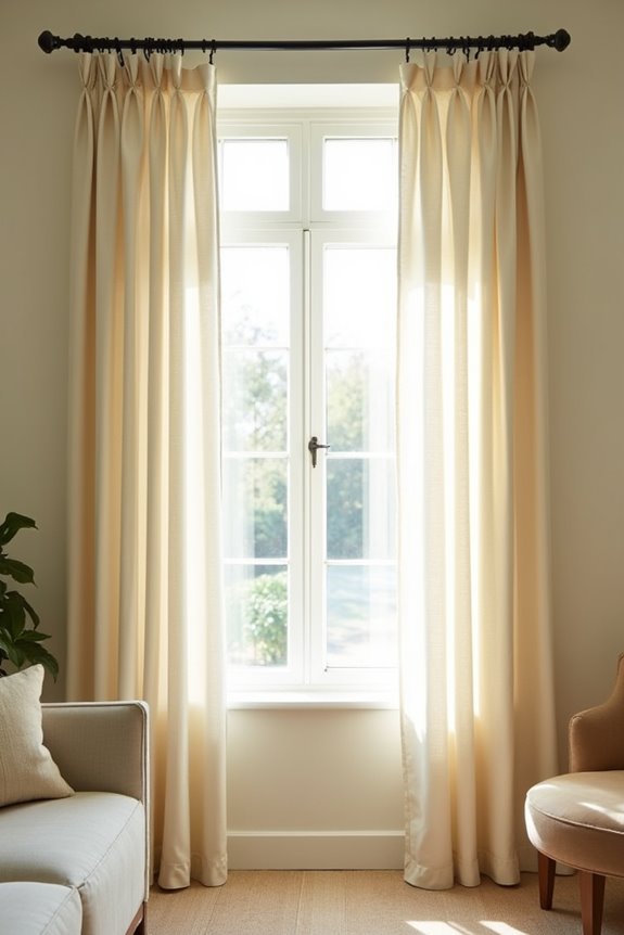
I’ve found that lighter curtains work well in smaller rooms or ones with darker walls—they bounce light around instead of absorbing it, which makes your eye perceive more space. When you choose a shade just lighter than your wall color, you’re creating a continuous, airy flow that makes the whole room feel more open. Try pairing pale fabrics with natural light, and you’ll notice how the room functions differently than it would with heavy, dark drapes.
Airiness Through Light Fabrics
They’ll open up your space and make it feel bigger than it actually is. I’ve found that light fabrics create an airy feel that refreshes any room. When you choose lighter curtains in a shade close to your wall color, you’re building color harmony that makes everything flow together smoothly.
Here’s why this approach works:
- Light fabrics fall and drape beautifully, enhancing that open look
- Daylight reflection bounces through the room, boosting room brightness naturally
- Fabric weight matters—thinner materials let natural light filter through, keeping spaces feeling fresh
The benefit here? You’re not fighting against your walls. Instead, you’re working with them. By matching your curtain shade to your wall color, you create continuity that invites calm and belonging. This simple choice improves how your space breathes.
Visual Expansion Techniques
When you’re looking to make a room feel bigger, lighter curtains are your key asset. I’ve discovered that curtains lighter than walls create visual expansion by reflecting natural light throughout your space. This technique changes how your room feels—brighter, airier, more open.
Here’s what I’ve learned works best:
| Room Type | Curtain Color | Wall Color |
|---|---|---|
| Bedroom | Cream | Soft gray |
| Bathroom | White | Pale blue |
| Office | Pale neutral | Warm beige |
Light curtains bounce natural light around, making wall color coordination straightforward. When you align curtain tones with your walls, you maintain balance while still achieving that expansive feeling. This openness isn’t just visual—it changes how you feel in the space. Lighter neutrals bring calm, belonging, and possibility into rooms that once felt cramped.
Matching Curtains Unify the Design
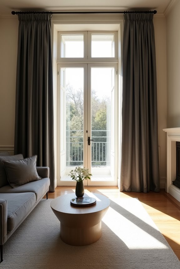
How do you create a room that feels polished and intentional? Matching your curtains to your walls delivers exactly that feeling. When you choose a tonal approach, your drapes blend seamlessly with wall color, creating a unified space that feels calm.
Here’s why this works:
- A matching color harmony makes rooms feel more spacious, helping ceilings appear higher
- Neutral tones reduce visual clutter, letting texture and patterns come through
- This seamless look delivers that polished, hotel-like finish
You don’t need exact matches. Slightly lighter or darker shades maintain harmony beautifully. I recommend choosing fabrics with interesting textures that complement your walls. This strategy unifies your design while keeping things interesting and personal—creating that welcoming space you want.
Let Room Function and Mood Guide You
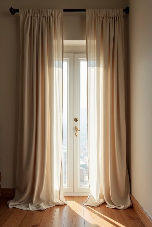
I’ve found that the best curtain choice really depends on what you’re actually doing in that room and how you want to feel there. Whether you need privacy and light control, want to create a warm atmosphere, or spend your days working and staying alert—these practical needs should drive whether you go darker or lighter. Let me show you how to match your curtains to your lifestyle, not just your walls.
Privacy And Light Control
Your room’s purpose tells you a lot about what your curtains should do. If you’re looking for real privacy and better light control, darker curtains are your answer. They absorb more light, making it harder for outsiders to peek in, while creating the calm atmosphere you’re after.
Here’s what darker curtains deliver:
- Strong privacy protection that works during both day and night without constant adjustments
- Superior light absorption that blocks unwanted brightness and helps you control your room’s ambience
- Consistent atmosphere across changing lighting conditions, keeping your space feeling balanced and deliberate
Darker curtains work best when paired with light walls—they anchor your windows without feeling heavy. The key? Choose fabrics with texture and sheen so your room doesn’t feel cramped. You’ll create a welcoming space that belongs to you.
Desired Atmosphere And Coziness
When you’re deciding between dark and light curtains, think first about the feeling you want when you walk into the room. I’ve found that darker curtains create that cocooning atmosphere you’re looking for. They anchor your space and draw your eye exactly where you want it to go.
Here’s what I like about this approach: darker curtains paired with light walls give you instant contrast and depth. Add velvet or matte textures, and you’ve got sophistication without feeling heavy. The key? Balance is everything. Since darker curtains demand privacy and light control, weave in other textures and colors throughout your room. This prevents that oppressive darkness from taking over. Your bedroom becomes your private retreat—relaxed, intimate, and truly your own.
Daily Activities And Time Usage
Now that you’ve got the cozy vibe down, let’s talk about what actually happens in your room day to day.
Your curtains darkness should match your daily activities and time usage. Here’s what I mean:
- Morning routines benefit from lighter curtains that let natural light interaction happen freely, supporting daytime tasks and reducing eye strain
- Evening activities like watching TV thrive with darker curtains for glare reduction and better viewing comfort without harsh reflections
- Nighttime cocooning requires curtains darkness for privacy and light control, creating the room mood you need for quality sleep
Think about your room lighting decision this way: if you’re working or reading during daylight hours, lighter curtains help. But when evening arrives and you’re settling in, darker options give you the privacy you’re looking for. The key? Match your curtains to how you actually live there.
Natural Light and Room Size Shift the Equation
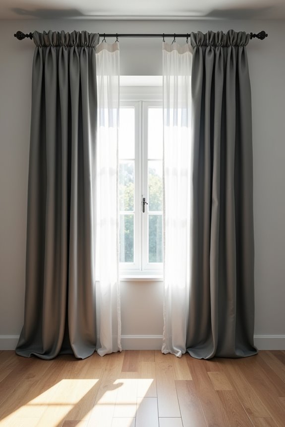
How does the light pouring through your windows actually change what curtain color works best? Natural light and room size work together to determine your ideal curtain choice.
In smaller rooms or dim spaces, lighter curtains brighten everything up and prevent the room from feeling cramped. North-facing rooms especially benefit from this approach since they get less sun. But here’s where it gets interesting: larger rooms with abundant natural light can handle darker curtains beautifully. They create dramatic focal points without shrinking your space.
South-facing rooms get strong, direct light, so darker curtains control glare and heat while adding coziness. The key? Match your curtain tone to your room’s natural light and size. Light colors enlarge perceived size; dark colors add intimacy.
Coordinate With Existing Furniture and Accents
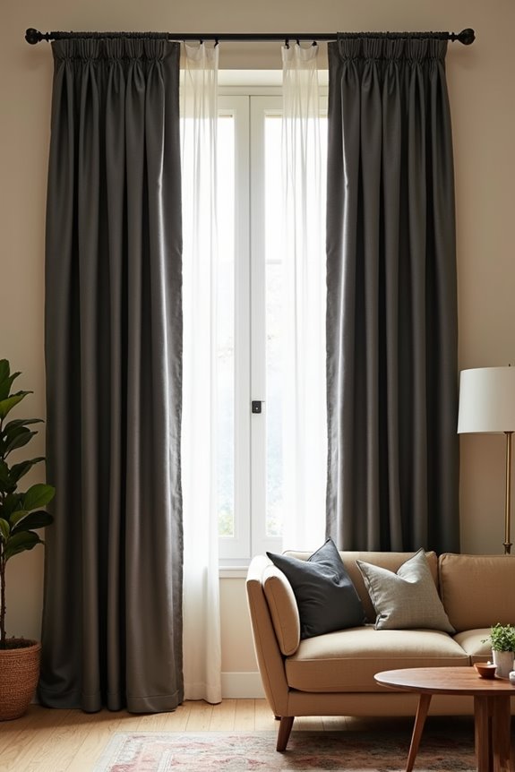
Your curtains shouldn’t exist in a vacuum—they’re part of a bigger design conversation happening in your room.
Curtains aren’t standalone elements—they’re integral players in your room’s overall design story.
I find that curtain coordination with furniture color creates the harmonious palette you’re after. Here’s how I approach it:
- Echo a dominant furniture hue for harmony, or repeat a secondary accent color for subtle connection
- Choose solid curtain tones when furniture features bold patterns, avoiding visual competition
- Pick up warm or neutral shades from existing pieces to anchor your space
When you’ve got warm furniture with wood tones and earthy fabrics, I’d select curtains that echo a lighter or darker shade from those tones. For neutral rooms, I introduce depth with color through slightly contrasting yet complementary curtains. This creates a cohesive design without overpowering your existing pieces. Pattern balance matters—solid curtain tones work best against busy furniture.
Textures and Fabrics Complete Your Vision
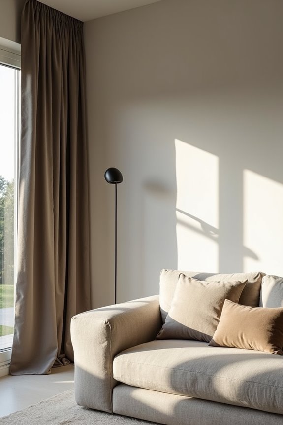
Once you’ve nailed down your furniture coordination, the fabric and texture you choose for your curtains become an essential component that brings everything together.
Here’s what I’ve learned: a matte wall paired with velvet curtains creates notable depth. The sheen catches light differently, adding dimension without needing darker colors. Conversely, linen curtains reflect more light, keeping rooms bright while maintaining visual interest.
Contrast drives the effect. Heavy fabrics like velvet absorb light, deepening your color impression, while lighter fabrics bounce it around. This texture play lets you match curtain and wall colors while still achieving that polished look you’re after.
I recommend experimenting with samples in your actual space. Watch how light reflection changes throughout the day. You’ll find that texture, not necessarily darkness, creates the sophisticated rooms you want.